Printable Version of Topic
Click here to view this topic in its original format
914World.com _ 914World Garage _ Making my own gauge faces
Posted by: CptTripps Dec 12 2013, 12:15 PM
I've been thinking a lot about the gauges I'm going to be using, and wanting to do something special. I was just going to go with the stock gauges and use modern innards (search for the Sunpro Tach thread) but realized that I am putting a 8,000rpm motor in.
So I busted out my handy vinyl cutter and Adode Illustrator to see if I could make my own.
Posted by: CptTripps Dec 12 2013, 12:16 PM
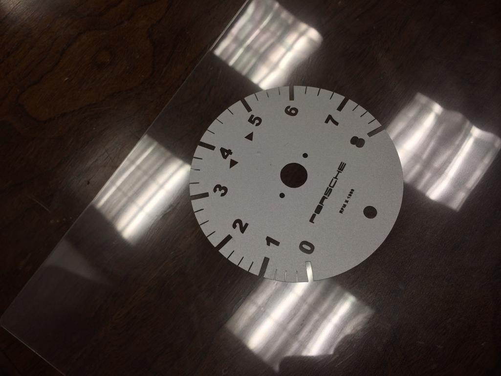
First step was making the gauge template. This is JUST A TEST so I wasn't going for scale.
Attached image(s)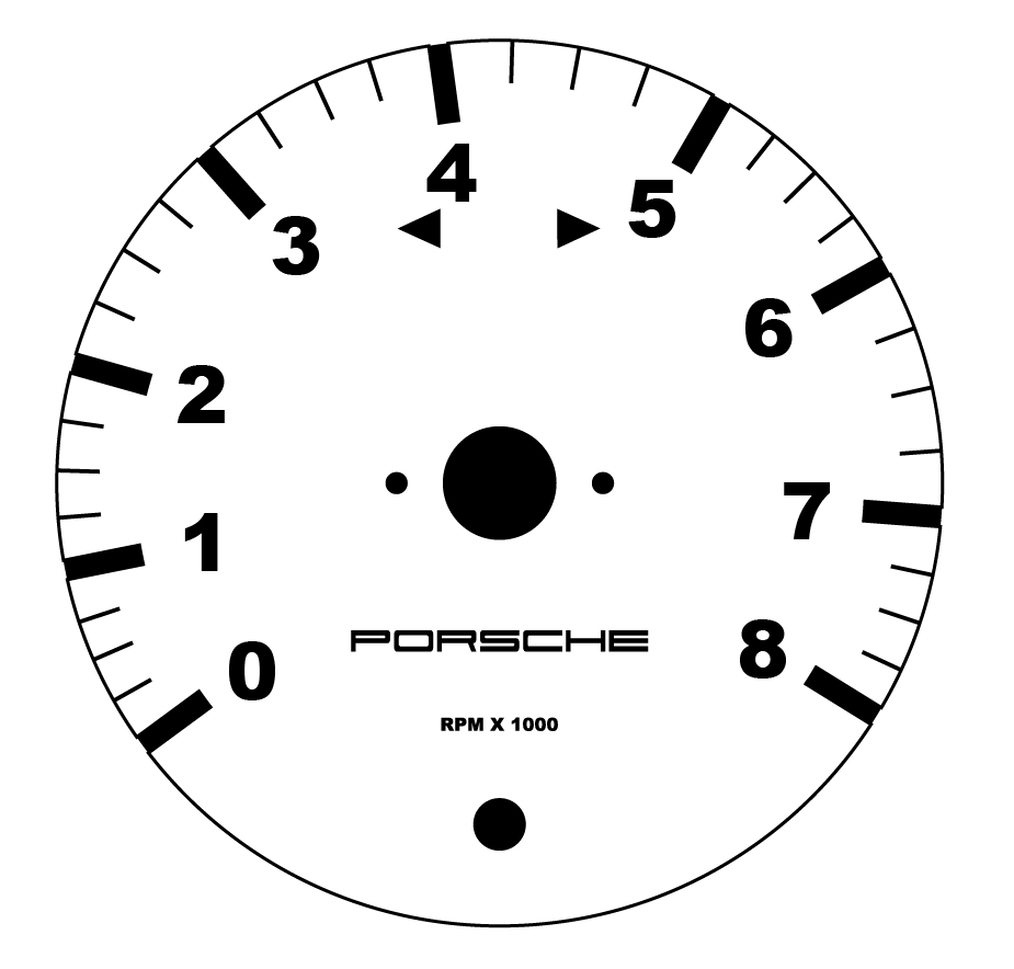
Posted by: CptTripps Dec 12 2013, 12:16 PM
Then I transferred it to my Vinyl Cutting program and loaded it up.
Attached image(s)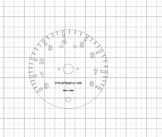
Posted by: CptTripps Dec 12 2013, 12:17 PM
Cut it on Silver vinyl. Not the best vinyl, but worked for the test.
Attached thumbnail(s)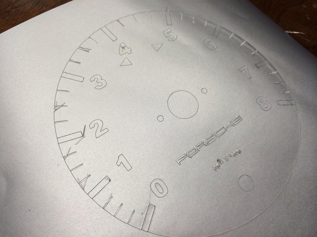
Posted by: CptTripps Dec 12 2013, 12:18 PM
Next I transferred it to some thick-ish Lexan.
Attached thumbnail(s)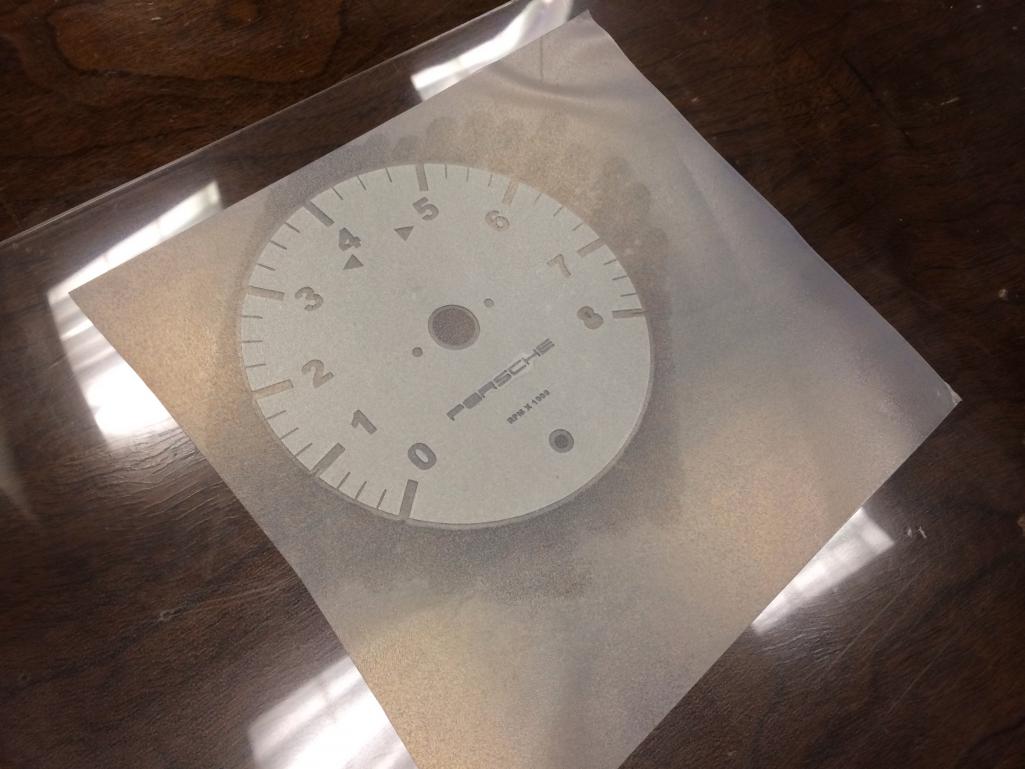
Posted by: CptTripps Dec 12 2013, 12:20 PM
Using my "RC Car Body" skills, I hit the redline with a sharpie real quick before the backing.
Attached thumbnail(s)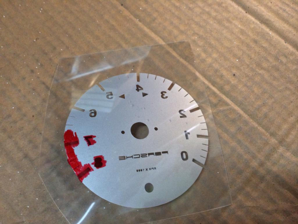
Posted by: CptTripps Dec 12 2013, 12:21 PM
Next I painted over the back with a quick coat of white primer. I'll use proper Lexan paint later, but this would give me an idea.
Attached thumbnail(s)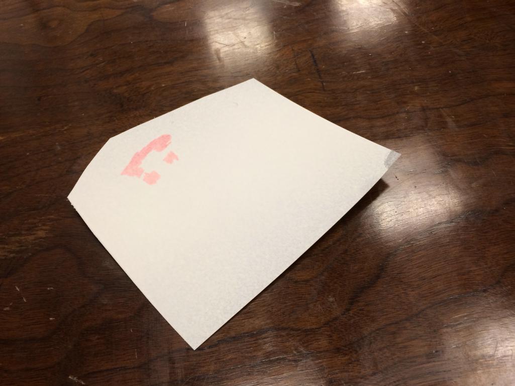
Posted by: CptTripps Dec 12 2013, 12:24 PM
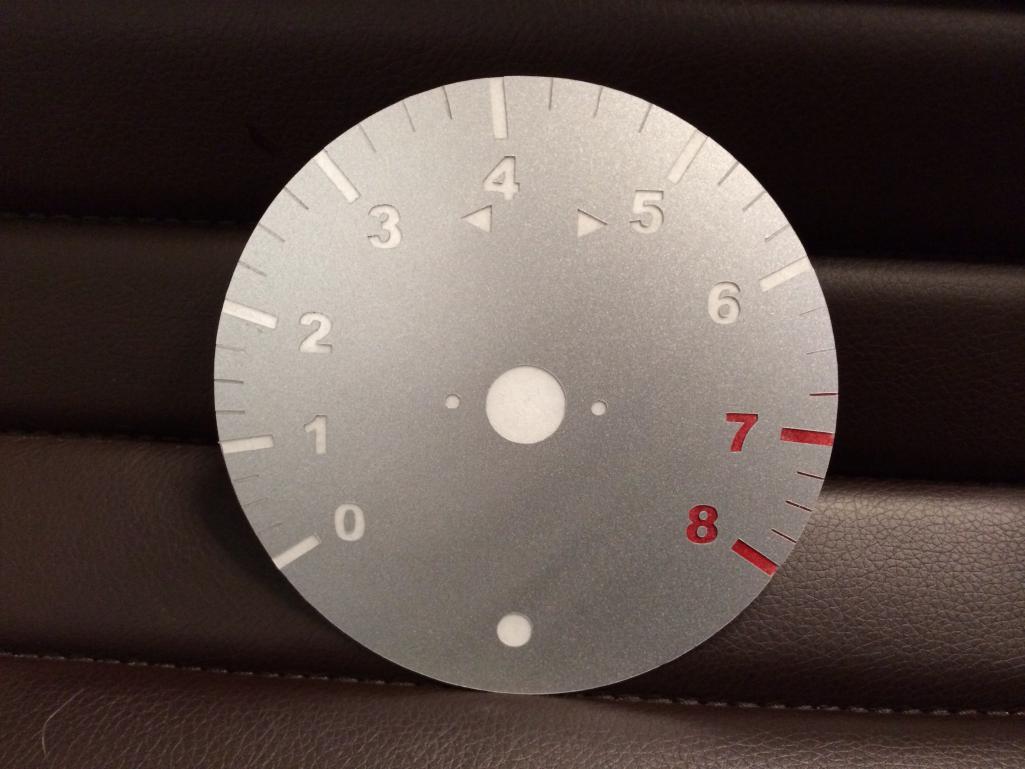
Viola! After a second coat, I'm getting an idea of how it'll look.
I'm going to let it dry a little more and then cut it out. I can already tell that the red sharpie isn't going to cut it. I have some red vinyl that I'll eventually use on the back before paint. That should do the trick a little better.
Attached thumbnail(s)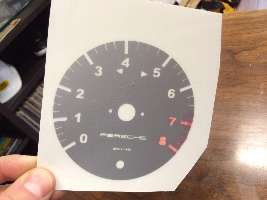
Posted by: CptTripps Dec 12 2013, 12:29 PM
I'm going to have to get rid of the bubbles before I put it through the laminator again. (Just a thought...it may not work at all.)
So...at the end of the day, I think it was worth 30min of time to see if I had a viable plan or not.
Some things I learned:
1: The lettering is a little TOO thin to do reverses on the PORSCHE and the RPM piece. Perhaps I'll do those in black vinyl and apply after the fact.
2: I need to pull the centers for the 4, 6, 8 so I can apply them afterwards. No biggie there.
3: Maybe a little thicker plastic with an additional black backer that's the reverse. That'll help focus the light on the numbers and I won't have any bleed for the light hitting the silver vinyl.
I'm going to thicken up the middle-ticks so they are a LITTLE thicker.
That's all I got for now...what do you think?
Posted by: nathansnathan Dec 12 2013, 12:48 PM
You should use this typeface to match the original gauges
http://fontzone.net/font-details/dinmittelschrift
Also, maybe do the "UPM/RPM" - it seems more euro and cool that way?
Posted by: zymurgist Dec 12 2013, 12:52 PM
Cool!
Posted by: CptTripps Dec 12 2013, 12:59 PM
My other thought was to use the font from the Boxster or new 911.
Another was to make the gauges look more like airplane gauges. I'm a watch guy and could make them out like a Bell & Ross or Panerai. Lots of fun ideas.
I just trimmed this one. Came out pretty bad, but now I know what I need to do. You never learn until you try!
Attached thumbnail(s)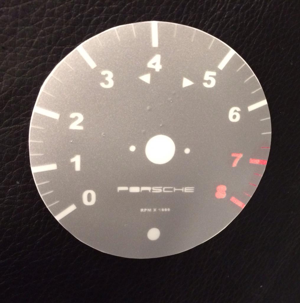
Posted by: ripper911 Dec 12 2013, 01:40 PM

Viola!
Viola?

Posted by: euro911 Dec 12 2013, 08:04 PM
Looks nice. Practice makes perfect.
![popcorn[1].gif](style_emoticons/default/popcorn[1].gif)
Posted by: r_towle Dec 12 2013, 08:14 PM
How did you cut the lexan without chipping it?
Posted by: mikesmith Dec 12 2013, 09:19 PM
Something like these?
http://www.newvintageusa.com/images/42346-01.jpg
Posted by: CptTripps Dec 12 2013, 09:31 PM
How did you cut the lexan without chipping it?
Lexan Scissors from any hobby store.
Something like these?
http://www.newvintageusa.com/images/42346-01.jpg
Those are bad-ass. Maybe I'll just bag the whole idea and buy those.
Posted by: CptTripps Dec 13 2013, 08:36 AM
Attempt #2: Much better.
Used a thicker vinyl and thin white plastic backing. Light comes through evenly and the red was a lot easier too.
Attached thumbnail(s)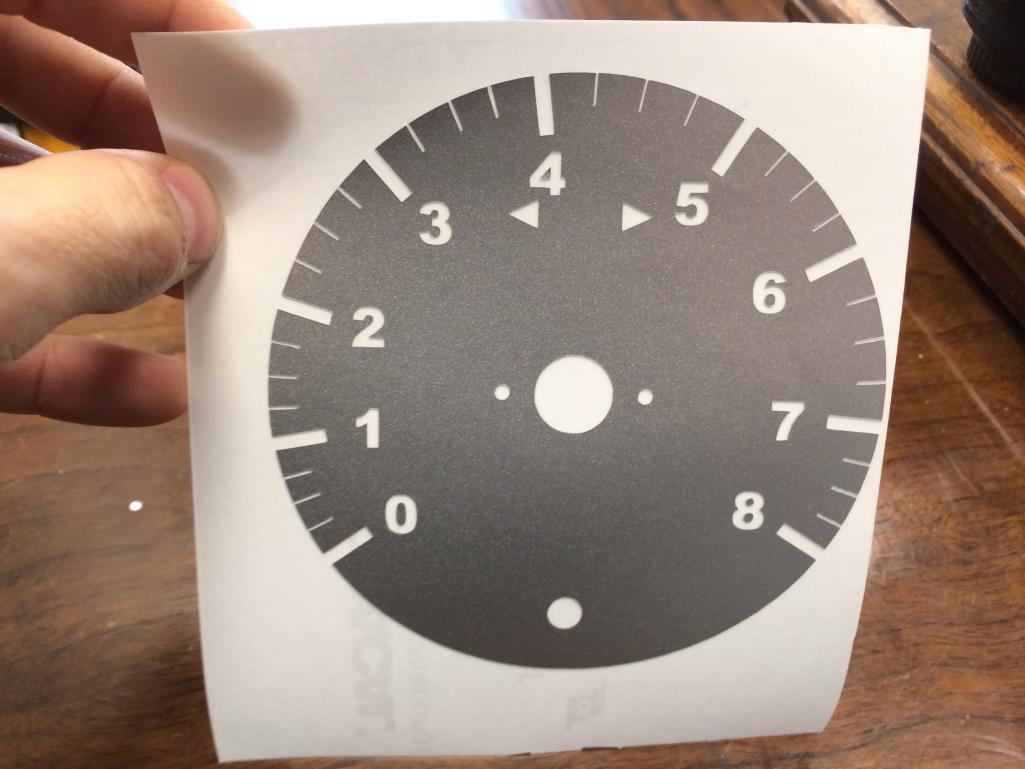
Posted by: Dave_Darling Dec 13 2013, 10:54 AM
The minor ticks still need to be fatter. Especially the red ones; the darker color (red vs. white) will look thinner so you need to thicken it up a bit to compensate.
(I used to do this stuff in software for a living.  )
)
--DD
Powered by Invision Power Board (http://www.invisionboard.com)
© Invision Power Services (http://www.invisionpower.com)