Printable Version of Topic
Click here to view this topic in its original format
914World.com _ 914World Garage _ OT Which do you prefer?
Posted by: seanery Jan 20 2005, 06:00 PM
Version 1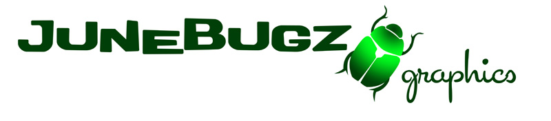
Version 2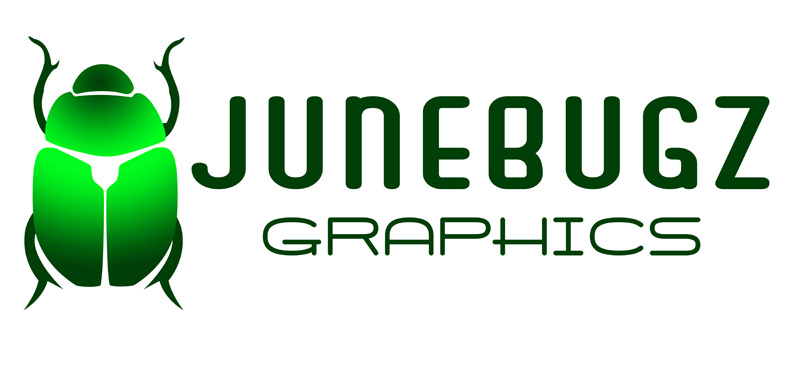
Version 3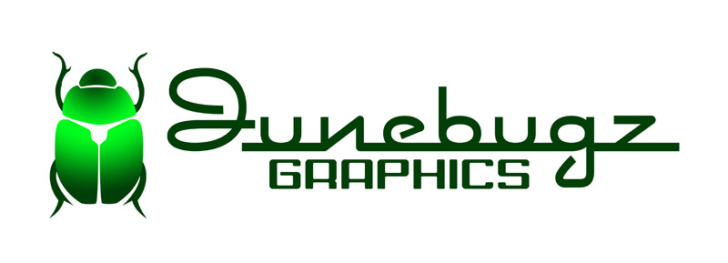
Version 4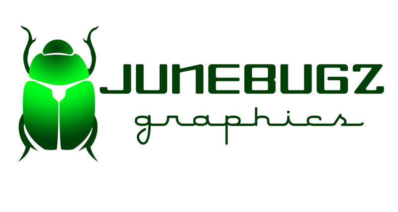
Posted by: BIGKAT_83 Jan 20 2005, 06:03 PM
Version 1 I hate big BUGS

Posted by: SirAndy Jan 20 2005, 06:03 PM
1.
- easy to read
- a-symetrical (which makes it more interesting, visually) ...
 Andy
Andy
Posted by: ws91420 Jan 20 2005, 06:04 PM
i voted 3 the bug isnt overwhelming and i like the psuedo cursive with the block style
Posted by: jim912928 Jan 20 2005, 06:04 PM
#1 just looks like more FUN!
Posted by: Headrage Jan 20 2005, 06:06 PM
#1, just seems to flow better and catches the eye.
Posted by: Rough_Rider Jan 20 2005, 06:08 PM
#1
Neat use of graphics, legible, would look good on top of a window.
Posted by: Twystd1 Jan 20 2005, 06:08 PM
In all honesty......
THEY ALL SUCK.... Really..
The truth is better than bullshit.....
Twystd1
Posted by: scruz914 Jan 20 2005, 06:12 PM
I voted for #1 for the same reasons given above. The offset text and tilted bug give it dimension. The a-symetry does catch your eye.
Posted by: GWN7 Jan 20 2005, 06:14 PM
| QUOTE (SirAndy @ Jan 20 2005, 04:03 PM) |
| 1. - easy to read - a-symetrical (which makes it more interesting, visually) ... Andy |
What he said
Posted by: seanery Jan 20 2005, 06:16 PM
| QUOTE (Twystd1 @ Jan 20 2005, 07:08 PM) |
| In all honesty...... THEY ALL SUCK.... Really.. The truth is better than bullshit..... Twystd1 |
what a dickweed...you could just say that you didn't care for them
 or you could explain why they suck...whatever
Posted by: Mrs. K Jan 20 2005, 06:19 PM
| QUOTE (SirAndy @ Jan 20 2005, 04:03 PM) |
| 1. - easy to read - a-symetrical (which makes it more interesting, visually) ... Andy |

Lisa

Posted by: dinomium Jan 20 2005, 06:25 PM
I voted for v1 as well because I have no will of my own. No, just kidding, I like the Name being the main focus of the logo...
Posted by: mercdev Jan 20 2005, 06:51 PM
#1 because the font looked more jungle-bugs-weeds-stuff and the image wasn't overwhelming (bug)
Maybe if you did #2 with #1's font.
Posted by: Bleyseng Jan 20 2005, 06:55 PM
#2 as its easy to read and a nice design! 
Posted by: kafermeister Jan 20 2005, 06:58 PM
I like #1 Sean. Looks like a modern business logo.
Rick
Posted by: xsboost90 Jan 20 2005, 06:59 PM
one or two...
Posted by: scotty b Jan 20 2005, 07:00 PM
#1 with #3's font, and the n the correct way
Posted by: balthazar Jan 20 2005, 07:52 PM
#4
I like it cause it's symetrical 
I can't believe that dude said they all suck! It brings to mind the old saying "if you don't have something nice to add then shut the F%&@ up A##hole!" 
Posted by: Gint Jan 20 2005, 07:55 PM
I like Junebugz font in #1 with the bug that size, but with the word graphics in a font like it is in #4 as well as the overall layout from 2, 3, or 4.
I voted for #4 because I wanted to be different.
Posted by: spare time toys Jan 20 2005, 07:59 PM
No. 1 because I like the use of the bug for a slash. But I dont like the "Z" for an "S" it is way over used IMHO.
Posted by: scottb Jan 20 2005, 08:01 PM
what is the target client?
younger and more creative, i say #1.
more conservative client, #3 or #4.
if doing business cards and stationary, no reason why you can't have a couple to accomodate your audience.
but all of them look great since i am still working on making stick figures on my pc!
Posted by: seanery Jan 20 2005, 08:15 PM
larry,
I bought the domain a couple of years ago...junebugs.com was way gone...soooooo....junebugz.com was next.
Originally, I was gonna make a kids site with coloring book pages and stuff, but I nixed that ide so it sat dormant.
I decided to do the vinyl graphics under the Junebugz Graphics moniker.
Posted by: Pnambic Jan 20 2005, 08:24 PM
Andy hit the nail on the head. Number 1 is easier to read. And afterall, that is kinda important. You might want to emphasize the "Z" though since it is different than normal and like you said, JunebugS is already taken. You don't want to drive people to the wrong site. 
Posted by: Sparky Jan 20 2005, 08:26 PM
#2 - I like the layout but the font needs something
Mike D.
Posted by: SpecialK Jan 20 2005, 08:31 PM
I didn't read anyones replies to the thread so as not to be influenced  , but I like the "haphazard" look of the font in Version #1. Kind of how June bugs fly (into the side of the house, into your hair, smacking off the sliding glass door...)
Posted by: redshift Jan 20 2005, 09:23 PM
I voted for Nader.
M
Posted by: type47fan Jan 20 2005, 09:51 PM
I like the subtle elegance of #1, however, I suggest that whichever you choose, please add the other set of legs that's missing in these representations. Presents "visual tension"  , at least for me. Insects have six legs. . . .
Good luck,
Posted by: VegasRacer Jan 20 2005, 09:58 PM
I like the layout of #1 and the font from #3.
Posted by: SpecialK Jan 20 2005, 10:15 PM
Insects have six legs. . . .
Good luck, [/QUOTE]
Terrible bug-zapper accident.....JB doesn't like to talk about it.
Posted by: smg914 Jan 20 2005, 10:56 PM
I like #1 because it flows the best.
Posted by: bernbomb914 Jan 20 2005, 11:07 PM
#1
flows better to the eye
Bernie
Posted by: bperry Jan 21 2005, 12:06 AM
I voted for #1. Just seemed more pleasing to me.
I went through logo selection and registration for a company
I started about 10 years ago.
Some other things you may want to consider.
How does it look when zeroxed? i.e. does it still look ok in b/w? (FAXes)
Logos that are long and narrow don't work as well on certain
things like watch faces, polo shirts, or shirt pockets.
You may want to consider a graphic only portion without
text that can be used as well.
A good example of this is to look at the Sun Microsystems logo.
http://www.sun.com (upper left corner)
They have their full logo which includes a graphic of the
letters "S-U-N" along with text. They also have just the "SUN" logo.
When you register your logo with the PTO it is a full graphic regardless
if it is just a graphic or a graphic with text.
So if you decide to register it, you may want to register multiple
versions so that you can protect versions with and with out text.
--- bill
Powered by Invision Power Board (http://www.invisionboard.com)
© Invision Power Services (http://www.invisionpower.com)