Printable Version of Topic
Click here to view this topic in its original format
914World.com _ 914World Garage _ SOT: Excel Help
Posted by: McMark Jul 6 2005, 10:51 PM
I don't know Excel very well. Can anyone help make me a graph of this data? I need the small numbers (<100) scaled up so that I can actually see the info. All I can do is get them overlapped at the bottom. 
http://www.914world.com/members/markd/misc/datalog.xls
Thanks.
Posted by: smrz914 Jul 6 2005, 11:07 PM
I opened up the file and columns A-E are highlighted. Is this the data you want graphed? Headings for the columns would be nice so I know what is being graphed vs. what (ie. x-axis is RPM and y-axis is HP).
Posted by: McMark Jul 6 2005, 11:24 PM
A-E are what I want. If I knew how to title the columns I would have.
They are:
A: RPM
B: Timing
C: MAP
D: TPS
E: Injector Pulse Width Thanks
Posted by: Jake Raby Jul 6 2005, 11:26 PM
Mark, is that Kit Carlson FI values?? Its hard to tell.
If so I already have a spreadsheet made up for mapping a 3D table for them.
It seriously helped the interpolation of the values for me given the resolution of his system...
Posted by: McMark Jul 6 2005, 11:29 PM
Yeah, it's KitCarlson. Any help would be appreciated. I'm just getting started with the data logging and Excel is kicking my ass right now.
Posted by: Jake Raby Jul 6 2005, 11:35 PM
email me
productdevelopment@aircooledtechnology.com
I'm at that computer now and will shoot the file on over ASAP.
It has my final fuel map for my 2056 that was using Kit Carlson already loaded into it.. 
Posted by: McMark Jul 6 2005, 11:37 PM
Email sent.
Just in case, my email is markd@mac.com
Posted by: Jake Raby Jul 7 2005, 12:11 AM
Reply sent..
I gave you an added toy to play with as well while I was at it... 
Posted by: McMark Jul 7 2005, 12:24 AM
Yipee!  Got them. Nice stuff. Thanks.
Posted by: grantsfo Jul 7 2005, 12:37 AM
Mark, Let me know if Jakes spreadsheet does the trick. I can setup a spreadsheet with chart that graphs these data points.
Posted by: Jake Raby Jul 7 2005, 12:43 AM
No sweat!
Play with that extra one I sent and see what true CR is with cam changes- Its good stuff!
Posted by: McMark Jul 7 2005, 12:53 AM
| QUOTE (grantsfo @ Jul 6 2005, 10:37 PM) |
| Mark, Let me know if Jakes spreadsheet does the trick. I can setup a spreadsheet with chart that graphs these data points. |
Jakes spreadsheet is a 3D graph of the VE table. I'd still like to see a graph of my data log. More info = better choices/understanding.
I'm uploading a much larger XLS file with more data.
Posted by: McMark Jul 7 2005, 12:24 PM
![]() Can someone make me a pretty graph?
Can someone make me a pretty graph?
Posted by: Part Pricer Jul 7 2005, 12:38 PM
I made a graph. I wouldn't really call it pretty though.
Attached thumbnail(s)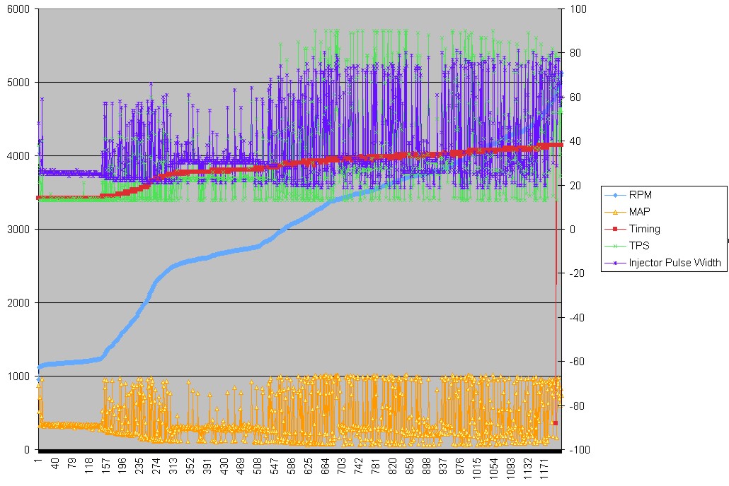
Posted by: McMark Jul 7 2005, 12:59 PM
Close! There's a line graph that doesn't plot the data points.
Posted by: Part Pricer Jul 7 2005, 01:05 PM
Like this?
Attached thumbnail(s)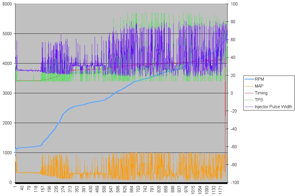
Posted by: McMark Jul 7 2005, 01:31 PM
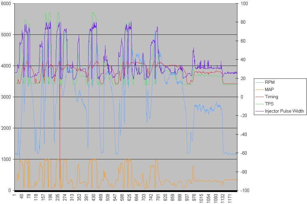
Sumthin' weird about that. Doesn't look like my real data. 
Posted by: Part Pricer Jul 7 2005, 01:46 PM
| QUOTE (McMark @ Jul 7 2005, 03:31 PM) |
| Sumthin' weird about that. Doesn't look like my real data. |
That's probably because I sorted the data by ascending by RPM. Here is the picture of the data as sent.
Attached thumbnail(s)
Posted by: McMark Jul 7 2005, 01:48 PM
Posted by: Air_Cooled_Nut Jul 7 2005, 02:18 PM
Here's what I came up with, without sorting the RPM values.
How do you attach an Excel file?
Attached thumbnail(s)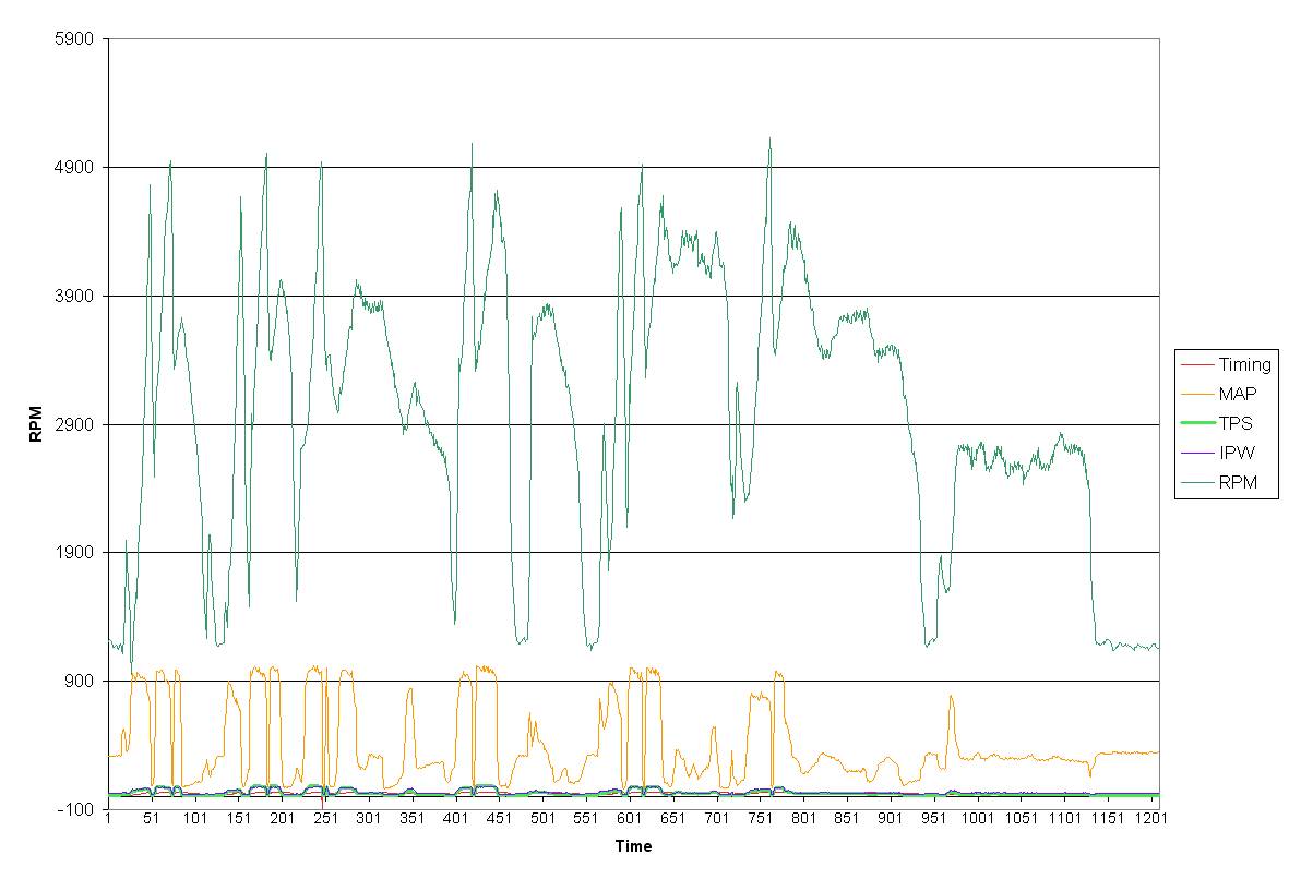
Posted by: Britain Smith Jul 7 2005, 03:39 PM
Here it is with the MAP data plotted to coorespond to the other data. You can see good correlation between the values.
-Britain
Attached thumbnail(s)
Powered by Invision Power Board (http://www.invisionboard.com)
© Invision Power Services (http://www.invisionpower.com)