Printable Version of Topic
Click here to view this topic in its original format
914World.com _ 914World Garage _ site changes, work in progress ...
Posted by: SirAndy Sep 12 2005, 09:46 PM
just in case you wonder ...
i'm currently working on making the pinned topics it's own, much smaller block.
so, if you see some weird stuff over the next half hour or so, it's me ...
 Andy
Andy
Posted by: trekkor Sep 12 2005, 09:51 PM

Thanks for all your work.
KT
Posted by: jonwatts Sep 12 2005, 10:15 PM
Thank you, I was just about to post something about all the nailed topics 
Posted by: Jenny Sep 12 2005, 10:21 PM
Dammit! The squeaky wheel DOES get the grease!
Jen
Posted by: pete-stevers Sep 12 2005, 10:22 PM
Hey i liked it the way it was.......just kiddin....looks great Andy
Posted by: Dead Air Sep 12 2005, 10:23 PM
nail this!
![]()
Posted by: trekkor Sep 12 2005, 10:23 PM
| QUOTE |
| see some weird stuff |
I see it now

KT
Posted by: seanery Sep 12 2005, 10:28 PM
I'm diggin' that one!
Posted by: McMark Sep 12 2005, 10:31 PM
Damn you Andy! You keep all the GLORY coding projects for yourself. CODING DIVA!
Posted by: rick 918-S Sep 12 2005, 10:31 PM
| QUOTE (McMark @ Sep 12 2005, 08:31 PM) |
| Damn you Andy! You keep all the GLORY coding projects for yourself. CODING DIVA! |


Posted by: Dead Air Sep 12 2005, 10:34 PM
I'm thinking
More
like this.
so topics are
easier to
define.
Or maybe/ like/ this/ so that / topics/ are easier/ to define
Posted by: Dead Air Sep 12 2005, 10:37 PM
Does ![]() mean "to the head of the class"
mean "to the head of the class"
Or more like  ?
?
I never understood 
Posted by: Jenny Sep 12 2005, 10:37 PM
sirandy'snotdoneyet.EverytimeIrefreshthepage,itchanges. 
Jen
Posted by: McMark Sep 12 2005, 10:37 PM
I think he'll tell us when he's done. I'm sure he's not keeping up with what we like or don't. He is a CODE DIVA after all.
Posted by: neo914-6 Sep 12 2005, 10:42 PM
what's different?
j/k, are you in the doghouse to have all this time?
Posted by: seanery Sep 12 2005, 10:44 PM
this is looking really nice, btw
Posted by: Engman Sep 12 2005, 10:52 PM
Must be super secret adim stuff!!

M
Posted by: jonwatts Sep 12 2005, 10:56 PM
Oops, accidentally posted this to stoopid's thread
Lookin' awesome Andy. Would it be possible to add the 'Goto Last Unread' icon ( ) to the nailed topics?
Posted by: SirAndy Sep 12 2005, 10:56 PM
| QUOTE (McMark @ Sep 12 2005, 09:37 PM) |
| He is a CODE DIVA after all. |


ok, seems to work, what'ya'all think so far? suggestions?
Andy
Posted by: SirAndy Sep 12 2005, 10:57 PM
| QUOTE (jonwatts @ Sep 12 2005, 09:56 PM) |
| Would it be possible to add the 'Goto Last Unread' icon () to the nailed topics? |
yes sir, hold on just a sec ...
Posted by: SirAndy Sep 12 2005, 11:06 PM
| QUOTE (jonwatts @ Sep 12 2005, 09:56 PM) |
| Would it be possible to add the 'Goto Last Unread' icon () to the nailed topics? |
ok, added. is it working????
 Andy
Andy
Posted by: McMark Sep 12 2005, 11:06 PM
FASTER!
Posted by: ws91420 Sep 12 2005, 11:15 PM
Hey while you are at it can you make it so that when you are viewing a post that isnt on page one and when you click to return to the forum that it takes you back to the page you were looking at instead of page one.
Thanks
Posted by: jonwatts Sep 12 2005, 11:15 PM
Sweet german measles, I like it!
Posted by: lapuwali Sep 12 2005, 11:18 PM
I like the new look. I was puzzled, at first, but I like it. Can't decide if it would look better "justified", with the columns all lined up, or not.
Posted by: McMark Sep 12 2005, 11:21 PM
Looks like a DIVA to me.  Sorry Andy, I was bored waiting for you to finish coding.
Attached image(s)
Posted by: SirAndy Sep 12 2005, 11:22 PM
added the topic description as well. people tend to put the event date in there ...
let's try left align ...
 Andy
Andy
Posted by: SirAndy Sep 12 2005, 11:24 PM
| QUOTE (McMark @ Sep 12 2005, 10:21 PM) |
| Looks like a DIVA to me. |

Posted by: SirAndy Sep 12 2005, 11:29 PM
ok, give me your opinion!!!
left align or center align? 
left align: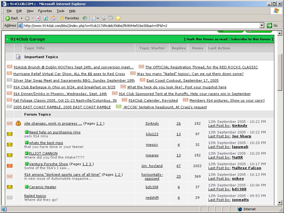
center align: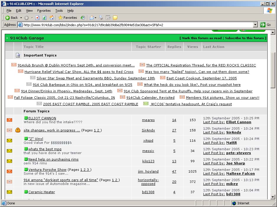
Posted by: jonwatts Sep 12 2005, 11:31 PM
Two columns (table)?
Posted by: seanery Sep 12 2005, 11:32 PM
left justify
Posted by: SirAndy Sep 12 2005, 11:33 PM
| QUOTE (jonwatts @ Sep 12 2005, 10:31 PM) |
| Two columns (table)? |
naaa, why waste precious screen real estate for us folks with BIG monitors ...
 Andy
Andy
Posted by: McMark Sep 12 2005, 11:39 PM
Table, no borders. Looks messy on my screen.
Attached thumbnail(s)
Posted by: markb Sep 12 2005, 11:41 PM
Lookin' good, Andy. 
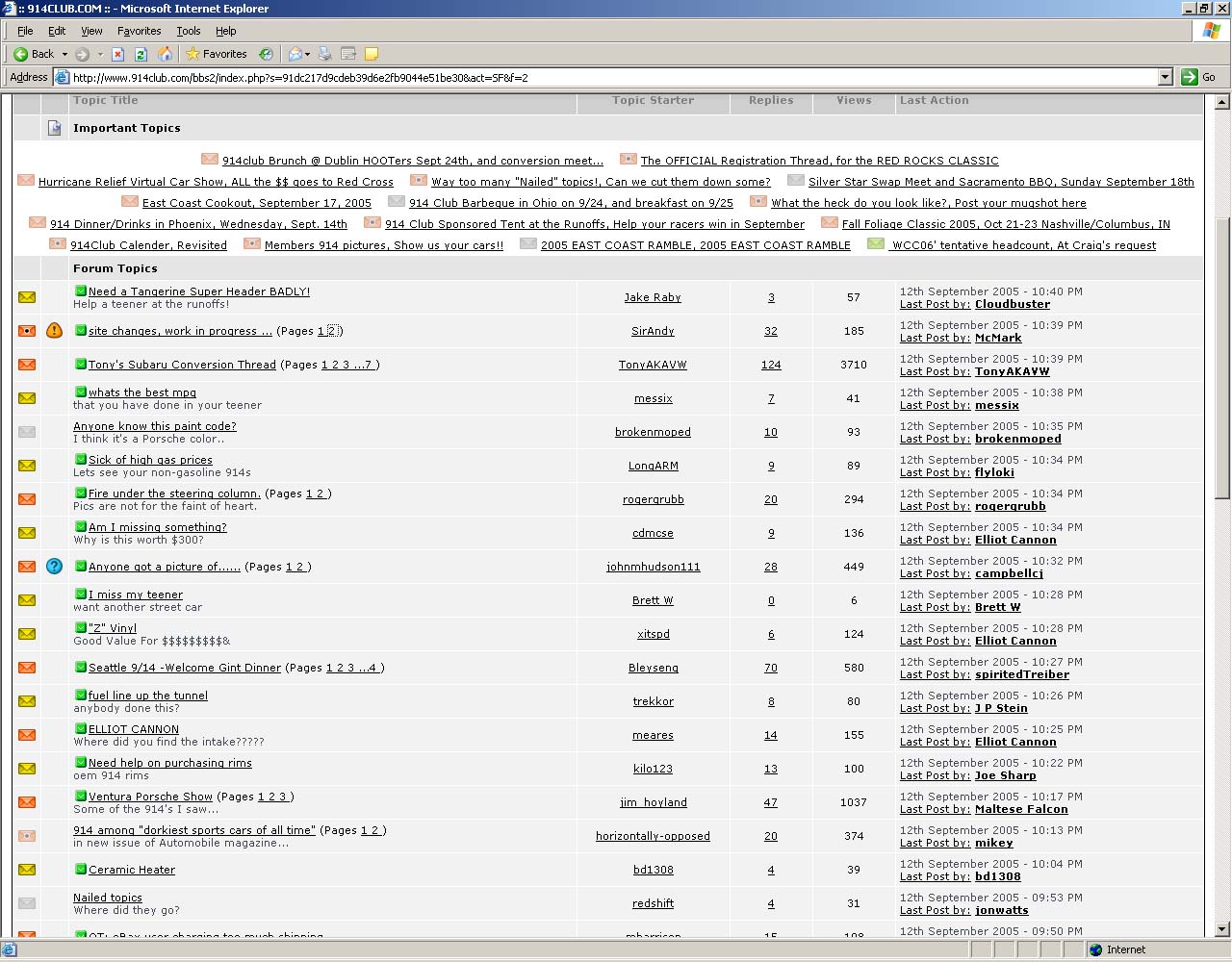
Posted by: SirAndy Sep 12 2005, 11:44 PM
| QUOTE (McMark @ Sep 12 2005, 10:39 PM) |
| Table |
nope, i don't think it should be a table. that'll cut down way too much on the useable space.
on my screen, i get 3 or even four topics per line as it just "flows" with the size of the browser.
no fixed columns ...
 Andy
Andy
Attached thumbnail(s)
Posted by: redshift Sep 12 2005, 11:44 PM
Make all the topics like that!
Great, after posting this, I spent 5 minutes clicking your picture... trying to get back to the garage..

M
Posted by: SirAndy Sep 13 2005, 12:10 PM
| QUOTE (redshift @ Sep 12 2005, 10:44 PM) |
| Great, after posting this, I spent 5 minutes clicking your picture... trying to get back to the garage.. |
ha ha (in my best nelson voice) ...

so, everybody OK with the new format?
Andy
Posted by: itsa914 Sep 13 2005, 12:17 PM
| QUOTE (SirAndy @ Sep 12 2005, 09:29 PM) |
| ok, give me your opinion!!! left align or center align? left align: center align: |
I vote left. the way it is now I find it hard to read teh topic titles.
Posted by: Toast Sep 13 2005, 12:25 PM
| QUOTE (SirAndy @ Sep 12 2005, 09:57 PM) | ||
yes sir, hold on just a sec ... |
It would be cool to still have the page numbers listed for easier access.
Some of these threads have multiple pages, like the RRC is up to 10 pages!
I like the look so far Andy!
Posted by: SirAndy Sep 13 2005, 12:25 PM
| QUOTE (itsa914 @ Sep 13 2005, 11:17 AM) |
| I vote left. the way it is now I find it hard to read teh topic titles. |
alright, 2 votes for left, 0 votes for center ...
that's good enough for me, left it is!
Andy
Posted by: Toast Sep 13 2005, 12:33 PM
<----- LEFT Align
Posted by: /L. Sep 13 2005, 12:42 PM
Thanks for ALL your hard work and keeping it straight! I appreciate it
Posted by: Marty Yeoman Sep 13 2005, 12:57 PM
I like it!!!!
Thanks for the housekeeping!
Posted by: trekkor Sep 13 2005, 04:55 PM
| QUOTE (ws91420 @ Sep 12 2005, 10:15 PM) |
| Hey while you are at it can you make it so that when you are viewing a post that isnt on page one and when you click to return to the forum that it takes you back to the page you were looking at instead of page one. Thanks |
Instead of hitting http://www.914world.com/bbs2/index.php?act=SF&f=2button on the 914 web page hit the "back" button on your browser.
KT
Posted by: Carlitos Way Sep 13 2005, 05:46 PM
Great work so far!!! My only suggestion would be to separate the club calendar from the other nailed threads... with links going from the calendar to each additional thread.
C.
Posted by: jonwatts Sep 13 2005, 06:22 PM
I changed my mind, I don't like it. I appreciate the smaller size but it's too unorganized. Now instead of glancing past it as I scroll down and maybe seeing which nailed topics have had activity I just visually avoid the whole space.
Never Satisfied Regards,
Jon
Posted by: fiid Sep 13 2005, 06:49 PM
if you put each topic name in it's own fixed size invisible table with no line breaks between - you might be able to get it so that they are aligned in even columns, but will go as wide as they can go given the browser windows size.
Just a thought - might not work.
Posted by: cooltimes Sep 13 2005, 07:15 PM
Looks good but a little tight on a 640X480 screen. Had to roll out to 1152X864 to get it to spread a little.
How about a little 914 theme music, played on a sawzall when logging in. LOL
I went to 1600X1200 for a view and coming back in edit mode. Nix on that size too. What screen size is the site using?
Posted by: ws91420 Sep 13 2005, 07:45 PM
| QUOTE (trekkor @ Sep 13 2005, 06:55 PM) | ||
Instead of hitting http://www.914world.com/bbs2/index.php?act=SF&f=2button on the 914 web page hit the "back" button on your browser. KT |
I do that normally but when i read a thread that is multiple pages it would be nice to do one click.
Posted by: SirAndy Sep 13 2005, 08:27 PM
| QUOTE (ws91420 @ Sep 13 2005, 06:45 PM) |
| I do that normally but when i read a thread that is multiple pages it would be nice to do one click. |
just do as i do ...
i always open a thread in it's own new window.
that way the page i'm on always stays and i can look through several threads without having to go back and forth. simply close the thread window when done reading ...
 Andy
Andy
Posted by: Rand Sep 14 2005, 01:21 PM
Andy, nice work. The "important" topics don't take up much real estate on my 1920 pixel wide screen! Schweet.
Another thought... sometimes the icon that goes with the topic title gets orphaned at the end of a line when the title wraps to the next line. It would be nice if they wrapped together. It may be as simple as using a set of HTML tags to keep them together? Maybe [NOBR]img then title then close...[/NOBR]
Just an idea. Thanks man!
Posted by: SirAndy Sep 24 2005, 12:08 AM
alright, back by popular demand ...
i added the "Pages" section to the end of the pinned threads so now you can see how many pages a thread has and go to the first/last page directly again ...
Andy
Posted by: markb Sep 24 2005, 12:20 AM
Thank you. 
Powered by Invision Power Board (http://www.invisionboard.com)
© Invision Power Services (http://www.invisionpower.com)