Printable Version of Topic
Click here to view this topic in its original format
914World.com _ 914World Garage _ Porsche LMP in color.
Posted by: maf914 Oct 7 2005, 08:27 AM
This color scheme doesn't do much for the car.
Attached image(s)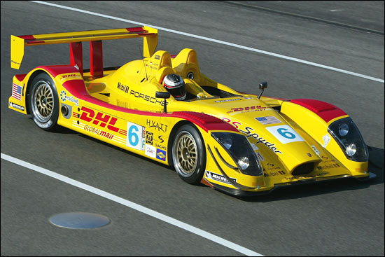
Posted by: mudfoot76 Oct 7 2005, 08:31 AM
Too bad the color scheme for the title sponsor (DHL) is 
Posted by: URY914 Oct 7 2005, 08:57 AM
Maybe it is just the angle of the shot and a shadow of the wing, but doesn't it look like the uprights for the wing are 6" wide and turned to face forward? 
Posted by: echocanyons Oct 7 2005, 09:35 AM
| QUOTE |
| doesn't it look like the uprights for the wing are 6" wide and turned to face forward |
optical illusion it think
Posted by: tdgray Oct 7 2005, 09:36 AM
What  I like it. very bright
Posted by: horizontally-opposed Oct 7 2005, 09:41 AM
Thought it was marginally ugly in plain white...then I saw it yesterday in DHL drag.
It's...just...hideous. Maybe it will look better from other angles?
Sure hope it's fast...oh, wait, it doesn't need to be to win in LMP2! 
The only way this car will impress me is if it challenges (and beats) the LMP1 category cars.
pete
Posted by: J P Stein Oct 7 2005, 09:56 PM
I gotta agree with Pete, that thing is Coyote ugly...no paint will help cover that. Invisiblility paint might wurk gud.
IMO, most race cars get uglier with "graphics" & paint these days. Penske used to have the most lovely paint/preperation on his sportscars....some of the prettiest things I've ever seen.
Those days are over,eh?
Posted by: grasshopper Oct 7 2005, 09:57 PM
yellow is faster 
Posted by: jimtab Oct 7 2005, 09:58 PM
How about a shot from the rear where we hope most competitors will see it most. Besides, Penske LOVES yellow...ever seen the vans? 
Powered by Invision Power Board (http://www.invisionboard.com)
© Invision Power Services (http://www.invisionpower.com)