Printable Version of Topic
Click here to view this topic in its original format
914World.com _ 914World Garage _ chicago contingent logo
Posted by: sk8kat1 Feb 16 2006, 05:55 PM
heres one
Posted by: sk8kat1 Feb 16 2006, 05:56 PM
here's #two 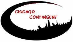
Posted by: Headrage Feb 16 2006, 06:03 PM
Where's the 914 in the logo?
I like the red one.
Posted by: sk8kat1 Feb 16 2006, 06:07 PM
where can i get the little outline from? I wanted to add it but couldn't figure out where to get it from
Posted by: qa1142 Feb 16 2006, 06:09 PM
red one
Posted by: Headrage Feb 16 2006, 06:09 PM
I think the one you see for the club is owned by Yaroon (Jeroen), so you would have to ask him.
I was just looking to see the numbers.
Posted by: sk8kat1 Feb 16 2006, 06:14 PM
like this or different..?
Posted by: roundboy914 Feb 16 2006, 06:19 PM
white one looks guud.
Posted by: Gint Feb 16 2006, 06:20 PM
The red one.
Shrink it down a hair. Shorter primarily. Wider is cool (but not too far).
Posted by: sk8kat1 Feb 16 2006, 06:34 PM
red a little shorter
Posted by: itsa914 Feb 16 2006, 06:51 PM
I like the red one also.
Posted by: Gint Feb 16 2006, 06:52 PM
| QUOTE (sk8kat1 @ Feb 16 2006, 05:34 PM) |
| red a little shorter |
See how tall mine is? Shoot for that. Or at least closer to it.
Posted by: sk8kat1 Feb 16 2006, 06:57 PM
here it is not as tall
Posted by: Jenny Feb 16 2006, 06:58 PM
| QUOTE (Gint @ Feb 16 2006, 04:52 PM) |
| See how tall mine is? Shoot for that. Or at least closer to it. |
No way Mike. Chicago skyline is way taller than boulder mountains.

Jen
Posted by: sk8kat1 Feb 16 2006, 07:01 PM
not as tall or wide
Posted by: Howard Feb 16 2006, 07:12 PM
Redone for SoCal
Attached image(s)
Posted by: Headrage Feb 16 2006, 07:12 PM
Nice. Just kinda fuzzy.
Like it really matters from a guy that likes in Bakersfield.
Been ther though. 
Posted by: Lou W Feb 16 2006, 07:20 PM
Isn't windy there? you should have the buildings leaning, and the sky should be white, just like snow.
jk
Looks great 
Posted by: jkeyzer Feb 16 2006, 07:34 PM
Turn down your jpg compression.
Posted by: sk8kat1 Feb 16 2006, 07:50 PM
better
Posted by: auggie91420 Feb 16 2006, 08:07 PM
Red one looks good, Mike.
Posted by: sk8kat1 Feb 16 2006, 08:11 PM
well here it is : if it needs to be tweeked let me know
http://i40.photobucket.com/albums/e221/sk8kat1/mainheader6.jpg
do the [img] things on either side to add to the signature
Posted by: sk8kat1 Feb 16 2006, 08:12 PM
it might get clearer .. but I don't know how to adjust the compression as suggested ..
Posted by: sk8kat1 Feb 16 2006, 08:14 PM
so how many arethere in the chicago area ?
Posted by: ChicagoChris Feb 16 2006, 08:23 PM
I'm in. Thanks for the hard work.
Posted by: Gint Feb 16 2006, 09:14 PM
Dude! That looks great. One minor detail. Your using a link to another site! Ick! Before you get too many people using that in their sig, upload the image from you PC to this site. Use you blog. I'll help you if I need to, just let me know. You don't want 20 people's every post including a sig that is a link to another site. Why slow anything down more than you have to.
Posted by: Gint Feb 16 2006, 09:15 PM
Here. Use this image for your link. It's now been uploaded to 914world.com
Copy and paste everything in this code block:
| CODE |
| [IMG]http://www.914world.com/bbs2/uploads/post-2-1140146140.jpg[/IMG] |
Attached image(s)

Posted by: Gint Feb 16 2006, 09:23 PM
I just changed the sig for you and ChicagoChris to use this image on 914club. You guys can change them back if you want to.
Posted by: sk8kat1 Feb 16 2006, 09:36 PM
thanks I wasn't sure how to do that I figured there was a way -- you said you uploaded that to a blog on here right?
Posted by: itsa914 Feb 16 2006, 09:56 PM
Excellent. Thank you! 
Posted by: Gint Feb 16 2006, 10:00 PM
| QUOTE (sk8kat1 @ Feb 16 2006, 08:36 PM) |
| thanks I wasn't sure how to do that I figured there was a way -- you said you uploaded that to a blog on here right? |
Not exactly. You can do that if you want to. That would be more appropriate than my doing it.
I downloaded your image to my computer. Than I did a post in this thread and attached that new image from my PC to this thread essentially. You could put the image in your blog, but then you'll have to change your sigs again.
Comprendi?
Posted by: ChicagoChris Feb 16 2006, 10:11 PM
Thanks. I went to change the link and it was allready done.
big brother is watching 
Posted by: sk8kat1 Feb 16 2006, 10:14 PM
tring this out
Attached image(s)
Posted by: Gint Feb 16 2006, 10:14 PM
| QUOTE (ChicagoChris @ Feb 16 2006, 09:11 PM) |
| Thanks. I went to change the link and it was allready done. big brother is watching |
Just tryin to help ya out. You don't have to start name callin.

Posted by: sk8kat1 Feb 16 2006, 10:17 PM
oh I see now .. that's pretty cool -- thanks for the info
Posted by: sk8kat1 Feb 16 2006, 10:18 PM
I had no idea I am thankful you could do it for me ..
thanks ! 
Posted by: Gint Feb 16 2006, 10:19 PM
| QUOTE (sk8kat1 @ Feb 16 2006, 09:17 PM) |
| oh I see now .. that's pretty cool -- thanks for the info |
Saw your blog. There you go.
Posted by: BigDBass Feb 17 2006, 08:17 AM
Great job! Thanks for working on the image!
Posted by: gopack Feb 17 2006, 08:29 AM
So we scrapped the idea of a more inclusive great lakes area contingent, or western great lakes area? would be WI IL, OH,MN MI IN?
that would help the few guys in wisconsin and rockford area too!
Posted by: sk8kat1 Feb 17 2006, 08:36 AM
well not really .. I just think we don't want to over extend .... there is already some sone from portage IN using the logo and I figured the milwuake / madison area is near enough ... and actually I am from the rockford area so I have that covered .. and there is at least one other guy actually in rockford that is probly going to chime in...
it just seems a bit far reaching to included MI, MN, and OH
I figured a few hours drive ( all that is bareable with stock seats) if we decide to have a get together is far enough ...if you start includeing OH , MN , MI then you may be talking trailers in stead of a nice leisurly drive to a 914 luv fest
Posted by: itsa914 Feb 17 2006, 10:19 AM
| QUOTE (sk8kat1 @ Feb 17 2006, 06:36 AM) |
| well not really .. I just think we don't want to over extend .... there is already some sone from portage IN using the logo and I figured the milwuake / madison area is near enough ... and actually I am from the rockford area so I have that covered .. and there is at least one other guy actually in rockford that is probly going to chime in... it just seems a bit far reaching to included MI, MN, and OH I figured a few hours drive ( all that is bareable with stock seats) if we decide to have a get together is far enough ...if you start includeing OH , MN , MI then you may be talking trailers in stead of a nice leisurly drive to a 914 luv fest |
Hey That's me
 (Portage Indiana)
We are just out side of Chicago (~40 miles) I can see the sky line from the lake shore here
besides 80% of my neighbors have Illinois plates on at least one car
Posted by: ChicagoChris Feb 17 2006, 12:57 PM
Normally I would be againt all things cheese,  but not in this case. It goes more to the poit of a few hours drive. Not a "state" issue. GreatLakes means going East till you hit ocean and I don't think that is really practicle. Besides....thoes SoCal boys may not even know where Portage or Madison are. So Chicago gives them a geographic point of reference.
Posted by: aircooledboy Feb 17 2006, 02:31 PM
| QUOTE (gopack @ Feb 17 2006, 09:29 AM) |
| So we scrapped the idea of a more inclusive great lakes area contingent, or western great lakes area? would be WI IL, OH,MN MI IN? that would help the few guys in wisconsin and rockford area too! |
Sorry Mark, but a brat will fly out my butt AND sing "Bear Down" before I will belong to any group that has the words "Green Bay" or "Cheesehead" in the logo.


Attached image(s)

Posted by: sk8kat1 Feb 17 2006, 03:30 PM
chris long time no see how's it been going ?
Posted by: gopack Feb 17 2006, 03:36 PM
I wasn't suggesting Cheeseheads.. i was jsut objecting to the chicago monicer as being to restrictive! that is all. for now i'll be a contingent of ONE!
Posted by: sk8kat1 Feb 17 2006, 04:44 PM
remeber one is the lonlest number....
I kid , I kid ....

Posted by: BEE DRIVEN Feb 18 2006, 09:08 AM
Hi Chicago Contingent, here are some ideas you could have if you want,or use for other ideas. Chicago is a awesome City!!
Nick.
Attached thumbnail(s)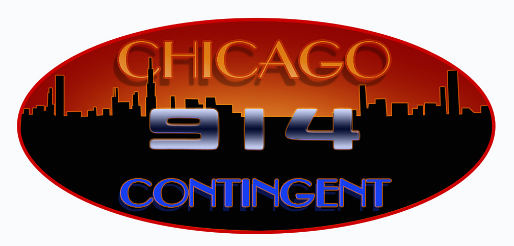
Posted by: BEE DRIVEN Feb 18 2006, 09:14 AM
This one showing a 914 porsche side view graphic.
Nick.
Attached thumbnail(s)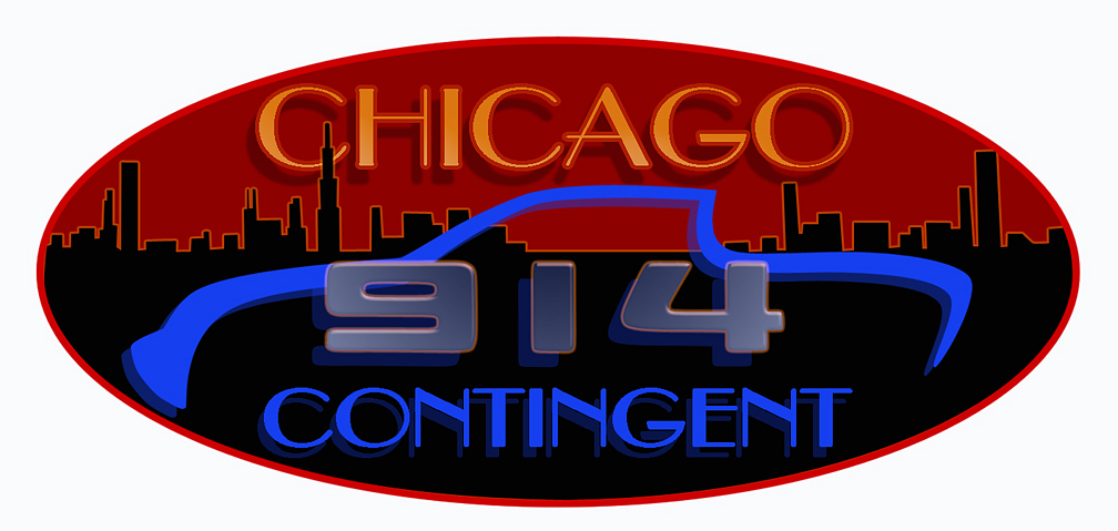
Posted by: BEE DRIVEN Feb 18 2006, 09:19 AM
Different shading on 914.
Nick.
Attached thumbnail(s)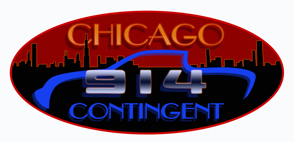
Posted by: BigDBass Feb 18 2006, 09:46 AM
Hey Nick, you just stepped it up a notch for Chi-town!
It looks great. Thanks!
I resized it:
Attached image(s)
Posted by: Bartlett 914 Feb 18 2006, 09:56 AM
I like the new oval one better! I like the "Chicago" part but I am a little biased. I am up for more suggestions that include more people. I don't know how many we are here in the immediate area. A contingent of a few is only slightly better than a contingent of one.
Posted by: BigDBass Feb 18 2006, 10:10 AM
Yeah, I'm all for a more inclusive description that would be acceptable to Mark and others in the "area". From what I've seen here, there're few enough 914ers in our part of the country that we need to stick together! So we just need something more specific than "Great Lakes" and more general than "Chicago". "Northern Midwest" doesn't have quite have the right ring to it. Maybe something aluding to our beloved snow and cold and road salt? Corn? Tri-state area? Some shared Interstate?
The name isn't as important as the fact that it seems people in the vicinity are putting some thought and effort into getting something going. It'd be great if we could have a BBQ or something this summer regardless!
Posted by: sk8kat1 Feb 18 2006, 11:02 AM
wow that looks better than mine!! -- I guess that's what happens when you have more than MS picture it to play w/
looks good 

Posted by: Bartlett 914 Feb 18 2006, 11:03 AM
Just a thought..
Midwest Loop?
Posted by: Eric_Shea Feb 18 2006, 11:40 AM
Being an Ex-Chicagoian (6300 N. Sheridan for 12 years)... it think the skyline looks a bit mis-represented. Hancock doesn't stand out (or exist) and Sears looks like the Emprie State Building... other than that I love it
Posted by: GeorgeRud Feb 18 2006, 02:13 PM
The oval sign rocks! It's known as the Chicago Region - PCA, and that includes all of northern Illinois, some Indiana members, and even a few Cheeseheads.
After the Parade that Milwaukee put together a few years ago, they should be proud to have their own cheesehead contingent, but are always welcome in Chicago. They did a great job!!!
Even though I'm an old Chicago boy (suburbs, actually), I've always admired the way that GreenBay has had it's own football team owned by the townsfolk, not some spoiled, megelomaniac millionaire! Elkhart Lake's Road America is also owned by the shareholders, many of which are local residents of the town, as well as Chicago Region SCCA types.
Wisconsin rocks, even though they do think of us as FIBs (F****in Illinois Bast**ds).
I'd gladly sign up for that Chicago Contingent Logo if you know how to do it. Thanks
Posted by: ChicagoChris Feb 18 2006, 04:42 PM
The new logo ROCKS!! 
George...Find the logo in the size you want
right click and copy address of image
go to your control page
then to the "edit signiture"...
above the box are a number of control boxes...click the one IMG
a new box will appear, now paste the address into the box and say OK 
You should have a new signiture.
Posted by: jim912928 Feb 18 2006, 04:46 PM
I'd like to play.....milwaukee here
Posted by: ChicagoChris Feb 18 2006, 05:15 PM
Hop on Jim...
Forsake your cheese heritage and get in the with the big city
OK just kidding. If Wisconson doesn't want to associate with the ChicCont  . Lots of great tings in Milwaukee too. Like OnTheBorder Gentlemans Club.
Posted by: dlo914 Feb 18 2006, 05:44 PM
how's this? lets try to keep these banners within the parameters of: Width 400 x Height 60 it makes for a cleanrt look to the forum.
Attached image(s)
Posted by: ChicagoChris Feb 18 2006, 06:42 PM
I like the wind effect. But the curent one can be resized. Right?
Really I am up for either. How does the rest of the group feel about it?
Posted by: auggie91420 Feb 18 2006, 08:00 PM
Great to see the Chicago area get some play in this group. Let's keep the area identified as Chicago (easy for me to say, as I live right in the city). I bought my car 21 years ago in Southern California, and when I moved to the midwest in '98, I pretty much put the car away in storage. It wasn't quite the same driving experience for me here, but great city nonetheless. Last year, I finally got my car out of storage; I just couldn't stand to see it just sit there. I rebuilt the motor and cleaned it up, and got it running in August. I'm looking forward to enjoying the car this summer and meeting other 914 people in the area. I'm also looking for any excuse to drive it around on something other than city streets. Hope this "contingent" gets going this year.
As far as the logo goes, my signature says it all. Great job.
Posted by: itsa914 Feb 18 2006, 08:30 PM
In 2004 I organized the windy city breakfast and we would have a good turnout. I wasn't able to do it last year and 2006 is going to be busy also. I would love to be part of a Chicagoland get together this year. Never to early to plan.
Posted by: jim912928 Feb 18 2006, 10:41 PM
I pass through chicago every friday and sunday (live in south bend, IN on the weekends). Guess I could be the "pass through" chicago contingent member! lol
Posted by: BEE DRIVEN Feb 18 2006, 10:53 PM
Hi again to the Chicago group, in this logo I have put in the correct Chicago Skyline at sunset with translucent car,and 914 graphic.
Nick.
Attached thumbnail(s)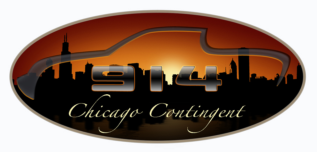
Posted by: BEE DRIVEN Feb 18 2006, 11:02 PM
Another in the same theme with different lettering font. The idea behind the translucent shapes of the car ,and 914 is so the city skyline flows through from side to side.
Nick.
Attached thumbnail(s)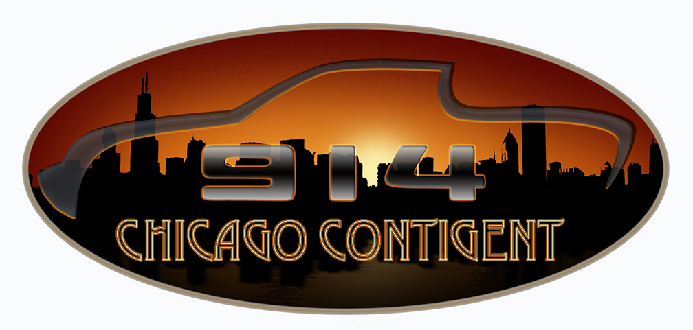
Posted by: jim912928 Feb 18 2006, 11:05 PM
I like the elegance of the one with "chicago Contingent" in the written script
Posted by: BigDBass Feb 18 2006, 11:09 PM
Damn, Nick, that's some nice work! I played with the image dimensions (in Photoshop 6) but I can't quite get it to not look stretched. Also, maybe you could add something like that windy effect?
(By the way, I don't suppose you do freelance logo design?)
Posted by: sk8kat1 Feb 18 2006, 11:20 PM
that's outstanding!!!!!
Posted by: BEE DRIVEN Feb 18 2006, 11:34 PM
| QUOTE (BigDBass @ Feb 18 2006, 09:09 PM) |
| Damn, Nick, that's some nice work! I played with the image dimensions (in Photoshop 6) but I can't quite get it to not look stretched. Also, maybe you could add something like that windy effect? (By the way, I don't suppose you do freelance logo design?) |
Hi Dan, for resizing the image in photoshop,go to IMAGE on top ,and click. Go down to IMAGE SIZE,click. In the lower left corner click on the box for CONSTAIN PROPORTIONS,than under the DOCUMENT SIZE in the same window type in the width size you want,and click OK...done.
I did do some wind,and blur in the water area. As for freelance,we could talk.
Thank you guys, Nick.
Posted by: sk8kat1 Feb 19 2006, 12:49 AM
holy crap did you guys know that we can get t-shrts printed up with this new bad ass logo on it for like $15.00 or a sticker for like $ 3.00
nick would that be cool with you if we used your design?.. I would completely understand if you would perfer not
here's the site
http://www.cafepress.com
Posted by: itsa914 Feb 19 2006, 08:56 AM
I would be in for a couple of shirts if they were done. Is there a minium order from cafepress? I think club member dlo914 made shirts up using them, right? If it happens great I'm in for 2 - 4 shirts (Me & wife).
Thanks to everyone for the cool logo designs.
Posted by: Bartlett 914 Feb 19 2006, 09:18 AM
I like them all! Count me in for a few shirts.
Posted by: sk8kat1 Feb 19 2006, 09:34 AM
actually it allows you to create your own shirts and order as many as you like or we can get together a design that we all aggree on and order from the site ....
I was messing around and made one the had on the front left breast :
Attached image(s)
Posted by: sk8kat1 Feb 19 2006, 09:35 AM
and on the bacjk across the shoulders :
Attached image(s)
Posted by: sk8kat1 Feb 19 2006, 10:07 AM
http://www.cafepress.com/chicago914
sorry nick jumped the gun -- I can delete if you are opposed to it .. I was up late last night and got the night crazies 
I cann add different versions if yo like too
Posted by: BEE DRIVEN Feb 19 2006, 10:48 AM
| QUOTE (sk8kat1 @ Feb 18 2006, 10:49 PM) |
| holy crap did you guys know that we can get t-shrts printed up with this new bad ass logo on it for like $15.00 or a sticker for like $ 3.00 nick would that be cool with you if we used your design?.. I would completely understand if you would perfer not here's the site http://www.cafepress.com |
All the logo designs are free for the Chicago Contingent to use,and produce. I would hope some of the extra money raised, if any would go to the Chicago Club to be used for their yearly events. All I ask is to have afew large T-Shirts with the logo for my time. Lets keep these great cars going for all to enjoy.
Thank you all, Nick Moskatow.
Posted by: alpha434 Feb 19 2006, 11:01 AM
Hey guys!!!
AWESOME! GOOD JOB! 


That REALLY looks good. Unlike our colorless mess. 
Posted by: sk8kat1 Feb 19 2006, 11:04 AM
they are being sold at the cost to buy them from the site .. no profit otherwise you have to have a business id# or a social security # so that the web site can report the ernings to the IRS
Posted by: gopack Feb 19 2006, 11:09 AM
| QUOTE (dlo914 @ Feb 18 2006, 03:44 PM) |
| how's this? lets try to keep these banners within the parameters of: Width 400 x Height 60 it makes for a cleanrt look to the forum. |
More RULES????
where will it all end?
Oh the HUMANITY!
Posted by: sk8kat1 Feb 19 2006, 11:32 AM
I will check to see about maybe a not for profit type thing to get some cash for the chicago area ..
as far as the shirts -- I will cover that .. nick tell me where they go and you will get them
thanks again!
Posted by: itsa914 Feb 19 2006, 12:54 PM
So it is cool to order some?
Posted by: sk8kat1 Feb 19 2006, 01:07 PM
yup .. they are the logo w/o the script .. if you want I can post one with the script... other wise all what you see can be ordered right now
Posted by: itsa914 Feb 19 2006, 01:18 PM
Nope, what is there is cool with me. Any chance of Grey with the got 914 on front and logo on back?
Posted by: ChicagoChris Feb 19 2006, 01:48 PM
OK stop it allready 
Can we just pick one. I vote for the blue 14. The gold one seems to fancy for a Chicago crowd. The blue stands out and the CHICAGO lettering is a good look. That is my voet atleast.
Posted by: ChicagoChris Feb 19 2006, 01:49 PM
WHAT?
Now I don't have one at all!
Please let us decide. All this back and forth is making me... 
Posted by: sk8kat1 Feb 19 2006, 02:15 PM
I will post another link with more options included
different stuf on each .... and yes chris more using the blue logo...
Posted by: ChicagoChris Feb 19 2006, 02:16 PM
I just want the maddenss to end. I love the look but lets decide.
Posted by: Bartlett 914 Feb 19 2006, 02:21 PM
Does it have to be one! Use any of the 3 to fit your mood.
I like them all. They are all close enough to not cause any confusion.
Posted by: sk8kat1 Feb 19 2006, 02:22 PM
here's the 2nd store .. it will only allow one design per type of shirt per store...
http://www.cafepress.com/chicago914club
Posted by: sk8kat1 Feb 19 2006, 02:26 PM
I added the links to my signature incase this thread gets lost along the way
Posted by: sk8kat1 Feb 19 2006, 03:21 PM
woo hoo! we have the first order of chicago 914 shirts!!!

Posted by: auggie91420 Feb 19 2006, 03:39 PM
Make it 2. Couldn't decide so I ordered both!
Posted by: sk8kat1 Feb 19 2006, 06:14 PM
if you guys want to see something else let me know
Posted by: BEE DRIVEN Feb 19 2006, 10:16 PM
Hi Chicago, here is one more logo with the correct city skyline,and blue graphics.
Nick.
Attached thumbnail(s)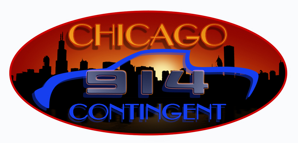
Posted by: ChicagoChris Feb 20 2006, 09:55 AM
Nick,
Is that one the right size for a signiture?
Posted by: sk8kat1 Feb 20 2006, 07:48 PM
ok boys .. I am switching back to the crap one I made ...
I am sick of the shit storm ...... and just tired .. I attempted to ask the ceator of the orginal club logo if it was ok to use the modified design for a small run just for our little community by way of a PM and not in the public eye to try and work this out ..
no response
so I am taking down the links and the stores
if anyone wants to help me work on a new one I would like that ...
.. still not real sure why I got scorched for what was an inocennt mistake that was not going to be mass produced or any thing.
either way I am tired of the bull shit and tired of tring to make some peace with this situation so that we can possibly still use the logo that nick made up ..
no response ...
so wave the white flag .....
I go to work today and come back to find that we are now ordered " for our own sake" to chaneg the logo by the end of the week ..
I would love to work this out , maybe we can .. but the designer of the club design seems to really be on his ear , and I can see his side , but truely no harm was intended
I am not like that I am for the most part a good guy ...
Posted by: BEE DRIVEN Feb 20 2006, 08:22 PM
I feel I need to show a true comparison of the two designs to the Chicago Contingent. I am willing to make adjustments to give you guys the best logo out there. It is not difficult to come up with a new 914 shape. Please review the comparison below.
Thank you, Nick
Attached thumbnail(s)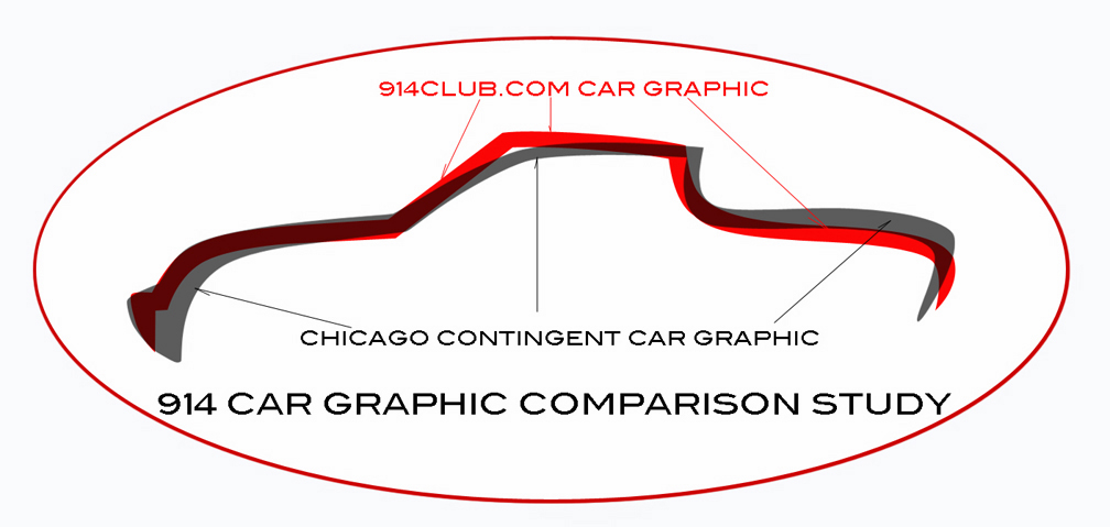
Posted by: alpha434 Feb 20 2006, 08:26 PM
You had better make that a open-able file. I can't read it.
Posted by: jim912928 Feb 20 2006, 08:26 PM
I USUALLY DON'T GET INTO ALL THE POLITICAL CRAP ON THIS SITE BUT LATELY THIS PLACE HAS GONE CRAZY...WHAT IS EVERYBODY DRINKING?
UNFORTUNATELY US MIDWEST GUYS WANTED TO BE in A 914 CONTINGENCY ALSO...WE HAD SEVERAL DRAW UP SOME COOL LOGO'S JUST FOR US MIDWEST GUYS...NOT TO MAKE MONEY...WE ACTUALLY ASKED IN THIS THREAD WOULDN'T IT BE COOL IF WE COULD HAVE A TSHIRT TO BIND US AND THIS CLUB...EVEN COMMENTED THAT IT "WAS NOT FOR PROFIT".
SADLY, WE HAVE LOST OUR WAY AND THIS PLACE IS BECOMING LIKE EVERY OTHER CRAPPY INTERNET SITE.
WE'VE LOST OUR SENSE OF FELLOWSHIP AROUND 914'S AND LOST OUR SENSE OF TOGETHERNESS.
IT'S BEEN A SAD MONTH.
JIM
Posted by: sk8kat1 Feb 20 2006, 08:34 PM
any help design wise is great , thanks nick.. I couldn't open the attachment either..
Posted by: itsa914 Feb 20 2006, 08:36 PM
Mike you did nothing wrong, and I for one am going to keep the logo in my sig. I don't see how you can copy right a silhouette of any vehical that unless you are the designer of that vechical or its company.
Posted by: alpha434 Feb 20 2006, 08:37 PM
Hey, guys. I commented before, and I've been following this loosely. I REALLY liked your guys' logo ideas. It's really a shame that you can't use them. BUT. The point of this comment is that the artists behind it should be proud. It really did look good. And I understand how it would piss someone off to not be able to use it. You'll all find another logo. I just wanted to say that I like what you guys are doing.
Posted by: ChicagoChris Feb 20 2006, 08:39 PM
| QUOTE (jim912928 @ Feb 20 2006, 06:26 PM) |
| UNFORTUNATELY US MIDWEST GUYS WANTED TO BE in A 914 CONTINGENCY ALSO...WE HAD SEVERAL DRAW UP SOME COOL LOGO'S JUST FOR US MIDWEST GUYS SADLY, WE HAVE LOST OUR WAY AND THIS PLACE IS BECOMING LIKE EVERY OTHER CRAPPY INTERNET SITE. WE'VE LOST OUR SENSE OF FELLOWSHIP AROUND 914'S AND LOST OUR SENSE OF TOGETHERNESS. IT'S BEEN A SAD MONTH. JIM |
Well put.
Nick...Thank you for the comparison. I guess there was a REAL difference.
Posted by: alpha434 Feb 20 2006, 08:41 PM
But it's probly not a good idea to keep using the banner. This will cause a LOT of trouble if you guys do. I remember all the trouble over the "moderator" thing. This site is changing. And even if it's not for the better, I'm going to stay out of the way and decide whether I want to stay AFTER it's done. It'll be like fighting an earthquake to struggle against it.
So let's PLEASE not try to piss anyone off.
Posted by: BEE DRIVEN Feb 20 2006, 08:47 PM
Thank you Chris, maybe the comparison will shed some light on the differences. No one wants to steal some other's pride,and joy. Keep in mind it still needs to look like a 914.
Nick
Posted by: itsa914 Feb 20 2006, 09:08 PM
What if the silhouette is faced the other direction or is that still pissing in Jeroens cherrios.
Posted by: alpha434 Feb 20 2006, 09:10 PM
| QUOTE (itsa914 @ Feb 20 2006, 07:08 PM) |
| What if the silhouette is faced the other direction or is that still pissing in Jeroens cherrios. |
Guys. Don't get the thread locked!
Posted by: itsa914 Feb 20 2006, 09:14 PM
Why, I'm asking a question. What if the silhouette is faced the other direction would that be ok?
Posted by: BEE DRIVEN Feb 20 2006, 09:17 PM
I am hoping Jeroen can review the comparision,and point out the areas of the design in which he has the most concern with. It would help the process of completing a new design. I respect Jeroen passion for his design.
Nick
Posted by: ChicagoChris Feb 20 2006, 10:34 PM
I think one of the 14-less logos will be best for now.
I like the Oval with the sunset skyline and the blue car. Looks to me like there are enough differences to avoid artistic "issues". He said that it was ok at first but that was before it went this far. So if he is against it now I think it will still look good.
Chris
Posted by: Bleyseng Feb 21 2006, 06:52 AM
| QUOTE (jim912928 @ Feb 20 2006, 06:26 PM) |
| I USUALLY DON'T GET INTO ALL THE POLITICAL CRAP ON THIS SITE BUT LATELY THIS PLACE HAS GONE CRAZY...WHAT IS EVERYBODY DRINKING? UNFORTUNATELY US MIDWEST GUYS WANTED TO BE in A 914 CONTINGENCY ALSO...WE HAD SEVERAL DRAW UP SOME COOL LOGO'S JUST FOR US MIDWEST GUYS...NOT TO MAKE MONEY...WE ACTUALLY ASKED IN THIS THREAD WOULDN'T IT BE COOL IF WE COULD HAVE A TSHIRT TO BIND US AND THIS CLUB...EVEN COMMENTED THAT IT "WAS NOT FOR PROFIT". SADLY, WE HAVE LOST OUR WAY AND THIS PLACE IS BECOMING LIKE EVERY OTHER CRAPPY INTERNET SITE. WE'VE LOST OUR SENSE OF FELLOWSHIP AROUND 914'S AND LOST OUR SENSE OF TOGETHERNESS. IT'S BEEN A SAD MONTH. JIM |
Not really, its just that artwork/design is copyrighted. To use it or something very similar is not cool so make the design original and be done with it.
O Mi Gado! I am gone for a few weeks and all you guys do is bitch....
Geoff
Posted by: sk8kat1 Feb 21 2006, 07:15 AM
please don't go there again!!! 
I and a few others are already working on a new logo
so drop it ..please
Posted by: akellym Feb 21 2006, 08:12 AM
I have never joined in on one these upheavals before but.... why not just trace the exact outline of the car?
Powered by Invision Power Board (http://www.invisionboard.com)
© Invision Power Services (http://www.invisionpower.com)