Printable Version of Topic
Click here to view this topic in its original format
914World.com _ 914World Garage _ OT: Graphic Design
Posted by: cbenitah Sep 2 2006, 06:25 PM
I have been looking at these for a while now and can't make up my mind.. They ar going to be a flyer you hand out. . . .
Thankful for various input. . . .
Posted by: cbenitah Sep 2 2006, 06:26 PM
hmm
Attached thumbnail(s)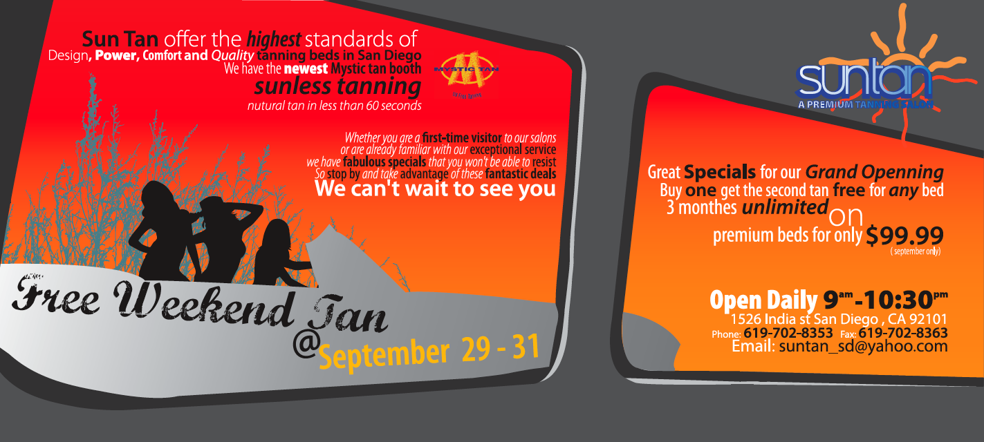
Posted by: HeloMech Sep 2 2006, 06:30 PM
I voted for the horizontal.
The vertical is a little more appealing as far as being suggestive.. maybe more appealing to guys. The horizontal, however, is better at getting the information across in a cleaner format and still interesting with it's layout.
My 2 cents.
Posted by: cbenitah Sep 2 2006, 06:34 PM
thanks HeloMech,
I spent more time on it as well...
Posted by: anthony Sep 2 2006, 07:48 PM
I like the colors on the first one but I find the graphic of the body weird and distracting - like the peninsulas extending out from the legs under "September 29".
Posted by: KaptKaos Sep 2 2006, 08:02 PM
In the vertical one, the K in weekend makes the girl look like she has a camel toe.
Aside from that, I don't understand the point of view for the second one. Seems like its the back of a station wagon view.
They are both cool tho. Nice work.
Posted by: cbenitah Sep 2 2006, 08:07 PM
you are looking through a window inside a car and next to you there is another car..
thanks
(at least no one said that I should move home) 
Posted by: Headrage Sep 2 2006, 10:19 PM
WTF are these? Was it a realy fat girl that still has the excess skin on the inside of her thighs? 
Attached thumbnail(s)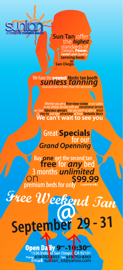
Posted by: Tettster Sep 2 2006, 10:29 PM
Her feet tucked under her, right? She's on her knees.
Posted by: Aaron Cox Sep 2 2006, 10:31 PM
perfect height then..... 
anyway... if she is on her knees, what are the big blobs at her knees?
Posted by: Qarl Sep 2 2006, 10:52 PM
I find the font shifts very distracting. italics, straight, bolt, white, black... too much shifting throughout.
Posted by: SGB Sep 2 2006, 11:37 PM
I agree with Karl about the fonts. The top one needs a blocky easily read font to stand out from the girl, I prefer the second - carwindow effect - one. At first I thought it was sunglasses. That would work. Also, they both have too much unformation. It is a big commitment to ask of a reader- make it easy on the eyes and brain....
Posted by: cbenitah Sep 3 2006, 05:04 AM
guys, all the info on the flyers need t o be there. Client told me so.
I like the window one.. i understand sbout the fonts, but to get the desired effect one needs t o add more interest for the viewer when its as much info as it is.. thanks for input though
2 swedish girls in the other room and im on the club site 
Posted by: balljoint Sep 3 2006, 06:01 AM
Forget the shape of the girl for a second and look at the shape of the blue area between her legs.
I think it looks like Dean Cain.
Nice work.
Posted by: Qarl Sep 3 2006, 08:21 AM
As a graphics guy, you should tell your client there is too much info on the ad.
I can think of two or three sentences that aren't critical to the ad. I dont' agree that the changes in fonts adds interest. Between the odd shapes and the every-changing fonts, I get a headache. Maybe I'm just turning into an old fart.
You asked for input, I'm just being honest.
Okay... here some more feedback...
Free Weekend Tan "@" September 29-31?
@ = at, right?
Reads... Free Weekend Tan "at" September 29-31st... doesn't make sense to me?
Also... and here it comes...
There are only 30 days in September?
Thank you... now where's my prize? 
Otherwise I like #2.... Can you angle the fonts a little to coincide with the angle of the window?
Posted by: cbenitah Sep 3 2006, 04:05 PM
I told him several times that it is to much info, the ad is only 4.75*10 which is not much space and an ackward size..
Sept 31st haha, I didnt look, I just took the text he provided me.. Free Weekend Tan does not make sense to me, but since english is not my first language I dont know..
I was thinking about that so it reads better.. But not sure, I will try though. Thanks for all the feedback.. Back to work again I guess..
Give me a while an I'll post the changes
Posted by: alpha434 Sep 3 2006, 04:24 PM
Move back to sweden, and get back with the supermodel.
Remember, your client's input is more important than ours. bring in both pictures and ask him which one he likes. I the crap doesn't sell, then it's not your problem. You're just the graphics guy, not his marketing director.
Posted by: JPB Sep 3 2006, 07:39 PM
GRAND OPENING needs to be relocated over the cooch area, thank you.
 Hello!
Posted by: SGB Sep 3 2006, 08:32 PM

GRAND OPENING needs to be relocated over the cooch area, thank you.
Hello!
an EXCELLENT idea. places all our other complaints in perspective.
Truely. Sex is used to sell EVERYTHING. I think that is because it works.
Also could say "FREE" in big letters across the region of focus.
Posted by: Qarl Sep 3 2006, 10:35 PM
Perhaps the silhouette in the top is giving birth.. and the things between her thighs are baby's legs...
... nah! That would be gross!

Posted by: cbenitah Sep 4 2006, 10:25 PM
K,
Here is another version. I cleaned it up a little and changed some colors to make it "pop" more..
I'm not liking the text to the right to much..
Any advice?
(Notice the new car.. had to put a porsche in there..)
Attached thumbnail(s)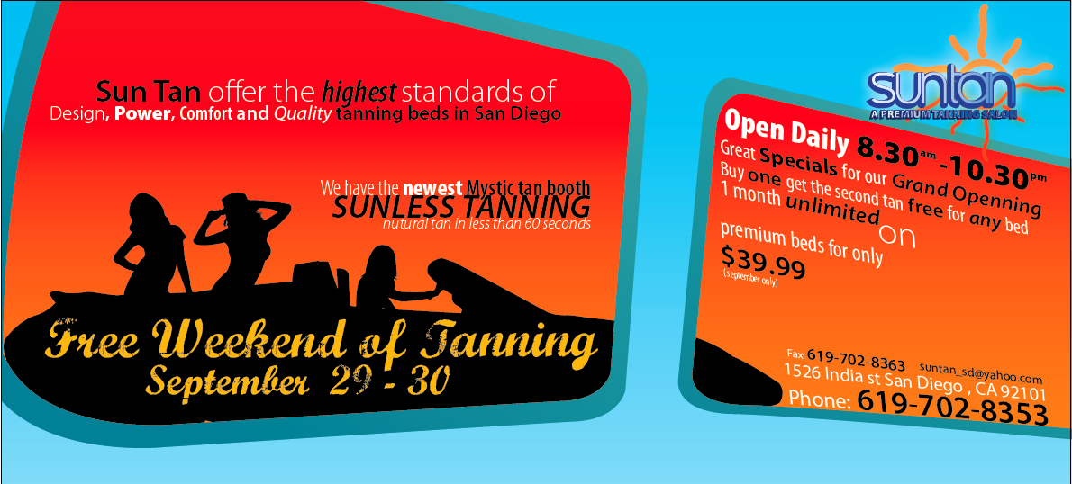
Powered by Invision Power Board (http://www.invisionboard.com)
© Invision Power Services (http://www.invisionpower.com)