Printable Version of Topic
Click here to view this topic in its original format
914World.com _ 914World Garage _ My logo
Posted by: akellym Jul 17 2007, 03:43 PM
Well what do you think? I put this on the back of the Blue Grass shirts.
Attached thumbnail(s)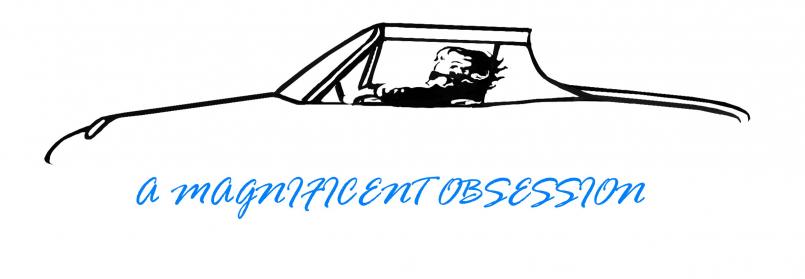
Posted by: sendjonathanmail Jul 17 2007, 03:52 PM
nice
Posted by: GWN7 Jul 17 2007, 03:54 PM
Very nice.....cept you neeed a hair cut 
Posted by: Rand Jul 17 2007, 03:58 PM
Cool. Maybe move the text up a little?
Watch your back for admins from another site warning you about using their outline.... Oy. Never mind. Haha.
Nicely done.
Posted by: sendjonathanmail Jul 17 2007, 03:59 PM
actually, did you experiment with a different text?? maybe the porsche text? -JON
Posted by: akellym Jul 17 2007, 04:06 PM
No that's the first text that I saw.
That design is a original by a famous video game artist!
Posted by: Eric_Shea Jul 17 2007, 04:11 PM
Very cool. I find myself agreeing with Jon. Try some different fonts. If you know the designer, ask him/her for font recommendations. I have a friend who owns a graphics company and it's amazing how much different these things turn out with a trained eye.
Posted by: Gint Jul 17 2007, 05:31 PM
That's one of the best looking 914 line art drawings I've seen in a very long time. IMHO it would look best with no text at all...
Posted by: akellym Jul 17 2007, 05:52 PM
Thanks!
The words are my idea, my brother did the art. This is the link to his company. http://massiveblack.com/mbNew/frontpage.html and one other http://www.conceptart.org/insomania/artists.shtml# - click on Jason Manley
I've been nagging him for what seems like years to do that for me.
Posted by: McMark Jul 17 2007, 05:55 PM
Very cool. I like the text. I like the font, but a different but similar font might really pop. I'm gonna go against the grain and say I'm not a fan of the 'Porsche' font.
Posted by: Johny Blackstain Jul 17 2007, 06:04 PM

That's one of the best looking 914 line art drawings I've seen in a very long time. IMHO it would look best with no text at all...
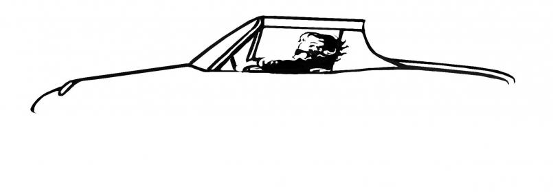
 I just cut it out & left it white. I was thinking "Martini Anyone?"
Attached thumbnail(s)
Posted by: SGB Jul 17 2007, 06:13 PM
I've got an ORIGINAL RELEASE Blue Grass Classic shirt. I feel so lucky...
I'm going to keep it preserved. Wear it on special occasions only. Yeah. Pat would like that. 
Really-
I'm just pokin' at both of ya. I'll bet Pat would buy you a beer. I would buy you both a beer and try to stir things up. I'm a bad person.
Posted by: Dan (Almaden Valley) Jul 17 2007, 06:23 PM
how about this
Attached image(s)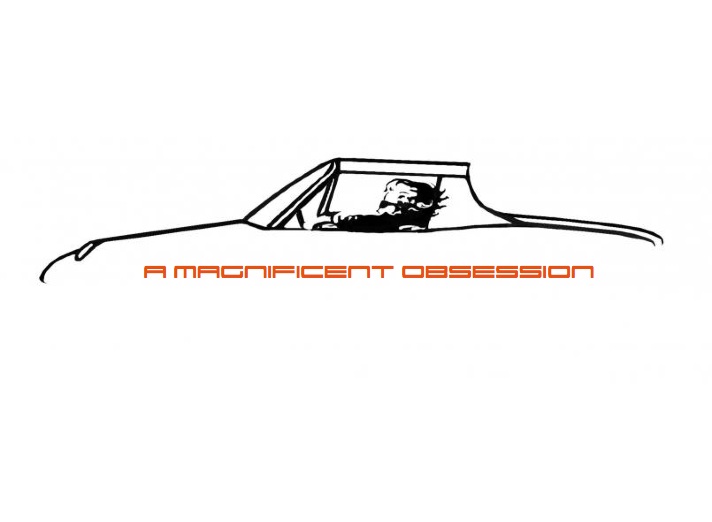
Posted by: Eric_Shea Jul 17 2007, 06:33 PM
Increase the font size. Drop the "A". Make it all Black.
My $0.04
Posted by: Johny Blackstain Jul 17 2007, 06:37 PM
No, drop the A, bigger font & same colors . After 33yrs I can't help but like white/orange best.
Posted by: Eric_Shea Jul 17 2007, 06:40 PM
Change your avatar then

Posted by: Johny Blackstain Jul 17 2007, 06:44 PM
Change your avatar then
Done. Careful what button you push, you might get what you asked for

Posted by: Dan (Almaden Valley) Jul 17 2007, 06:46 PM
OK
Attached image(s)
Posted by: Dan (Almaden Valley) Jul 17 2007, 06:48 PM
OK
or
Attached image(s)
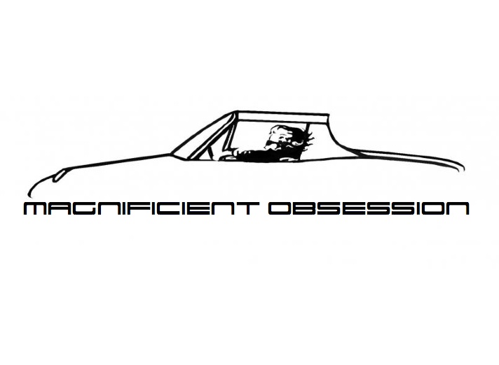
Posted by: McMark Jul 17 2007, 06:52 PM
my 2 cents
Attached image(s)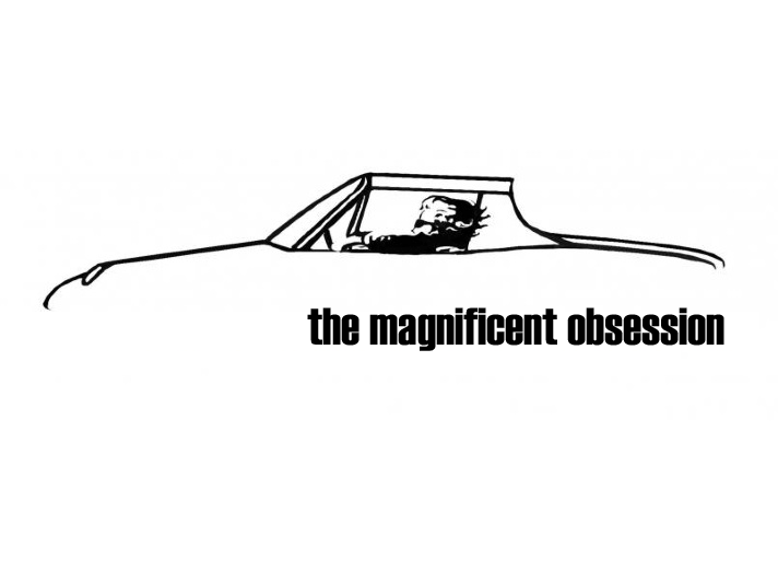
Posted by: Johny Blackstain Jul 17 2007, 06:52 PM
OK
YES!!! Damned I like that!


Posted by: akellym Jul 17 2007, 06:57 PM
That's one of the best looking 914 line art drawings I've seen in a very long time. IMHO it would look best with no text at all...
I just cut it out & left it white. I was thinking "Martini Anyone?" I think it really dates you, if you can recognize the guy driving
I like the black best so far.
I'm thinking of make some hats and shirts, if I get some good ideas.
If I make the stuff it will be sold at cost to club geeks
Posted by: Johny Blackstain Jul 17 2007, 06:59 PM
That's one of the best looking 914 line art drawings I've seen in a very long time. IMHO it would look best with no text at all...
I just cut it out & left it white. I was thinking "Martini Anyone?" I think it really dates you, if you can recognize the guy driving
I like the black best so far.
I'm thinking of make some hats and shirts, if I get some good ideas.
If I make the stuff it will be sold at cost to club geeks
The Maxell guy catching the martini glass.. or was it Memorex? No, Maxell. I'm 44 & audio is what I do. Nice
Posted by: markb Jul 17 2007, 07:03 PM
[/quote]
The Maxell guy catching the martini glass.. or was it Memorex? No, Maxell. I'm 44 & audio is what I do. Nice
[/quote]
THAT'S what it reminds me of!
I love the line art.
Posted by: 7T Porsha Jul 17 2007, 07:07 PM
Topless! 914.bmp ( 280.42k )
Number of downloads: 77
914.bmp ( 280.42k )
Number of downloads: 77
Posted by: akellym Jul 17 2007, 07:14 PM
That's nice too.
Any ideas for the back of the hat? Maybe something on the sleve of the shirt?
Posted by: BahnBrenner914 Jul 17 2007, 07:32 PM
I like the one topless, looks better with that wind-blown hair.
Also, does it seem empty with nothing down below, like wheels or arches or anything? or jackstands? 
Posted by: Rand Jul 17 2007, 07:33 PM
My $.02, move text up into graphic and soften. I think the Porsche font would look better than the one I stuck in.....
Attached image(s)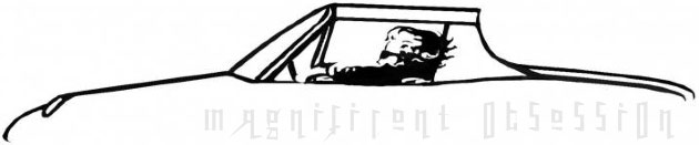
Posted by: sendjonathanmail Jul 17 2007, 07:36 PM
or make the font white, so its there, but its not really there -JON
Posted by: Dr Evil Jul 17 2007, 07:57 PM
I think it alienates all of our bald or balding members 

Posted by: akellym Jul 17 2007, 08:20 PM
it's really hard to get a sense of motion from a bald head, unless you have really loose skin!
Posted by: Crazyhippy Jul 17 2007, 08:21 PM
I think it alienates all of our bald or balding members
So did nature

Posted by: Johny Blackstain Jul 17 2007, 08:51 PM
I think it alienates all of our bald or balding members
So did nature
Posted by: brant Jul 17 2007, 09:49 PM
I miss my hair....
kelly,
you gonna come to moab again?
Posted by: akellym Jul 17 2007, 09:58 PM
I miss my hair....
kelly,
you gonna come to moab again?
Yes I am planning on it. Are you planning to meet in Denver again? I would like no snow this time!
Posted by: brant Jul 17 2007, 10:01 PM
I've put a call in to the higher powers.
no snow and no broken clutch cables are now guaranteed
email me as I'm the register:
brant914@hotmail.com
will you bring your son again?
we dropped the price.
brant
Posted by: akellym Jul 17 2007, 10:11 PM
I've put a call in to the higher powers.
no snow and no broken clutch cables are now guaranteed
email me as I'm the register:
brant914@hotmail.com
will you bring your son again?
we dropped the price.
brant
email sent.
Posted by: dflesburg Jul 17 2007, 10:18 PM
i hate hippies.... hippies hate water.
Posted by: lotus_65 Jul 18 2007, 04:44 AM
anyone have the "carrera" font?
that might be cool.
Posted by: BarberDave Jul 18 2007, 05:04 AM
I also have a ( ORIGINAL SHIRT) don't change a thing. Now just wait a minute
Does that make me a CW ??????
Dave 
Powered by Invision Power Board (http://www.invisionboard.com)
© Invision Power Services (http://www.invisionpower.com)