Printable Version of Topic
Click here to view this topic in its original format
914World.com _ Originality and History _ 914 engine lid Porsche letter spacing
Posted by: Thomas J Bliznik Jul 23 2006, 01:20 PM
Hi Pat & Concours people.
Here's something I think everyone will need sooner or later in the life of your 914.
I got these dimensions from George Hussey @ AA. I believe they are correct.
Tom
BTW Pat: You may want to post (above) in the nailed file.
Attached thumbnail(s)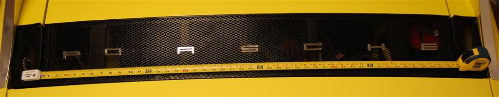
Attached image(s)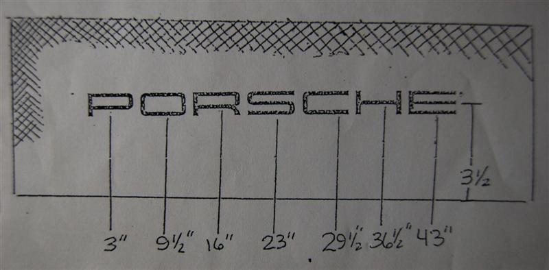
Posted by: Thomas J Bliznik Jul 23 2006, 01:26 PM
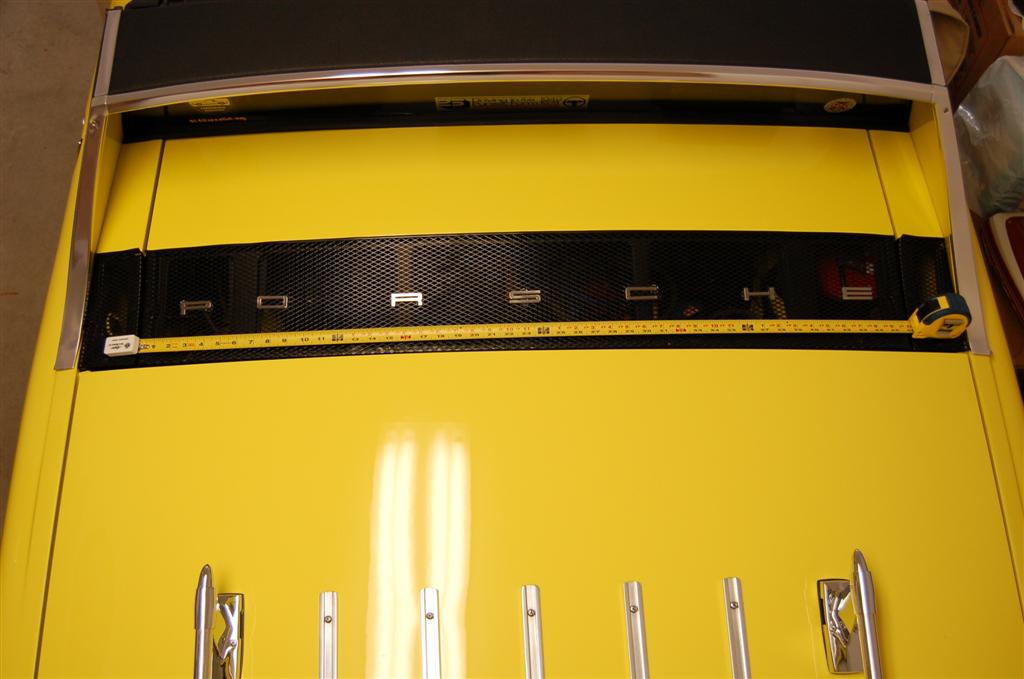
Let me try this for a little more clarity.
Tom
Attached thumbnail(s)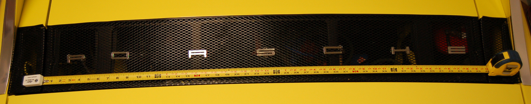
Posted by: Pat Garvey Jul 23 2006, 06:55 PM
Tom,
Great post!
You wouldn't believe (yeah, I guess you would) how many times I've seen the script scattered! Lot's of folks will do whatever it takes ti get the letters spaced to what they think is "clean", but they never are!
Pat
Posted by: Jeff Bowlsby Jul 25 2006, 10:22 AM
er um..."O"...Tom...what happened to the "O" in that photo...?
Posted by: tod914 Jul 25 2006, 04:38 PM
Meanwhile back at Tom's garage..... 
Posted by: Thomas J Bliznik Jul 26 2006, 09:20 AM
O-My, this is a tough crowd. Been caught by the CW Police!!! Another thing to put on my "do" list. Tod914 sent me a personal note & we were waiting for Pat to notice & jeff beat him to it.
Thanks Tod914 for moving the "O" over.
Tom
Posted by: Thomas J Bliznik Mar 13 2007, 09:26 PM
bump
Posted by: Pat Garvey Mar 19 2007, 07:32 PM

bump
Tom,
I liked the original pic. Left room for a second "O", as in "POORSCHE".
KnowwhutImean?
"Now that there's funny"
Pat
Posted by: Garold Shaffer Jul 27 2007, 02:48 PM
Are those numbers to the center of the letters or the leading edge of them?
Posted by: Brian Mifsud Jul 27 2007, 02:54 PM
Spacing looks great.. but the spelling leaves so much on the "resale table"... look how many hits you get in Ebay and Craigslist when you enter "P-O-R-C-H-E"
Posted by: Lavanaut Sep 10 2008, 12:48 PM
I'm getting ready to do mine again and went back and dug up a picture I put together last time I did this. Seems a bit archaic, sure, but the spacing ends up "perfect", and meets the dimensions specified in the above diagram. It's just a lot easier to do this way in my opinion, since you don't have to deal with keeping a tape measurer in place, etc. YMMV. 
Where stated, "n full diamonds showing" means at least n full diamonds, but not n + 1. For example, "4 full diamonds showing" might mean that you actually see 4 full ones and part of a 5th one, but not 5 full ones.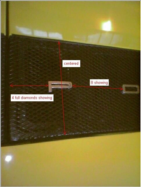
Posted by: Lavanaut Sep 16 2008, 05:46 PM
I'm getting ready to do mine again and went back and dug up a picture I put together last time I did this.
I just replaced the letters on my /6 this past week and used this approach again. It worked great, the spacing ended up perfect.
I won't grow hair on my palms for quoting myself will I?
Posted by: ellisor3 Nov 29 2009, 12:23 PM
I realize I am following up on an old topic, but I have found the correct spacing for the lettering and thought I would post them for future questions.
Attached thumbnail(s)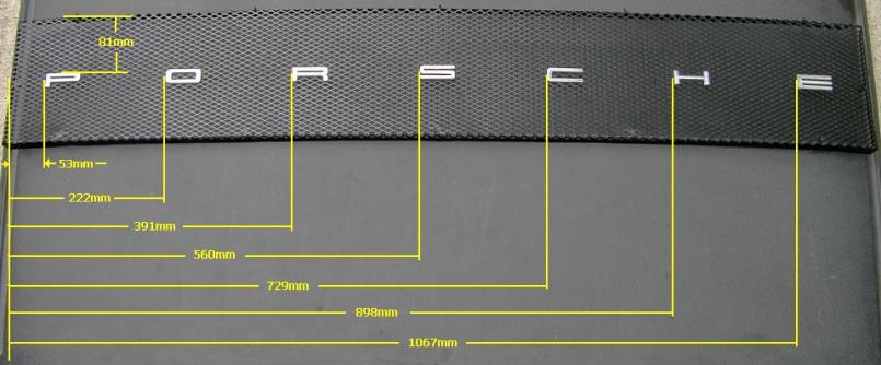
Powered by Invision Power Board (http://www.invisionboard.com)
© Invision Power Services (http://www.invisionpower.com)