Version 2
Version 3
Version 4

 Andy
Andy
| QUOTE (SirAndy @ Jan 20 2005, 04:03 PM) |
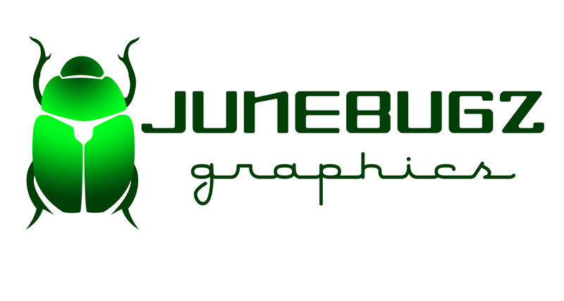
| 1. - easy to read - a-symetrical (which makes it more interesting, visually) ... Andy |
| QUOTE (Twystd1 @ Jan 20 2005, 07:08 PM) |
| In all honesty...... THEY ALL SUCK.... Really.. The truth is better than bullshit..... Twystd1 |
 or you could explain why they suck...whatever
| QUOTE (SirAndy @ Jan 20 2005, 04:03 PM) |
| 1. - easy to read - a-symetrical (which makes it more interesting, visually) ... Andy |


 , but I like the "haphazard" look of the font in Version #1. Kind of how June bugs fly (into the side of the house, into your hair, smacking off the sliding glass door...)
 , at least for me. Insects have six legs. . . .