QUOTE(SirAndy @ Oct 19 2016, 06:37 PM)

QUOTE(Tom_T @ Oct 19 2016, 06:33 PM)
However, I'll say now that I thought that the original font on the 914 world logo was much much better, & I'd prefer to see it go to a stock or modified stock closer to that look for both the hats & badges etc., & for the website.
It just looked more "914" than the "pointy" font now used.
I don't know if Porsche set their "legal beagles" on you Andy to change it, but perhaps there is a way to get "official permission" to use a font closer to the original, if they did threaten you with legal action.
Did you just volunteer to convince the lawyers at PCNA to let us use the Porsche font again?
![popcorn[1].gif](http://www.914world.com/bbs2/style_emoticons/default/popcorn[1].gif)
Well yes, I believe I just did Andy - or at least to try talking to them about it on a prelim basis, if you have the specific person to talk to about it.

Note that I am NOT a lawyer, but after 46+ years in the real estate/development industry & running my own business for 33+ years, I have dealt with my share of lawyers & negotiations.
However, it sounds like the overall font is in the public domain according to Mike Fitton - just as are Helvetica, Microgramma (which is close the Porsche & 914 font), etc. - so it should not be an issue.
"The type font used for the original "914" badges is in the public domain Porsche does not own it. Now the Porsche name that is a different story.
Mike Fitton"And then again, there are other not-for-profit ways around the use, as euro911/Mark says below....
"Make them up with the real PORSCHE font, and state that any monetary transactions would be considered 'donations' ... not sales - then the lawyers can pound sand cool_shades.gif
Mark S..."If Mike is correct, then there is/was no reason to change the font on 914world, but I haven't researched this like you others may have.
Andy, you've got my PM/email contact info, & I'll be going to the new PCNA HQ & Experience Center this trip, since I missed out in May when my tooth blew-up & I had to fly home for an emergency (redo) root canal & missed going in.
So - as I said above - PM/email me for my cell # & we can talk when mutually convenient, if you want to pursue the PCNA avenue. I'm not getting email updates on this post, so you'll have to contact me directly to carry my volunteering any further.
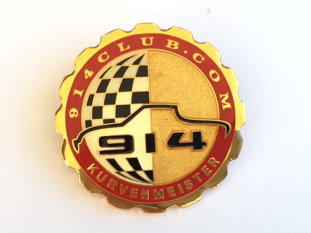
Again, my vote would be for a multi-color embroidery of the original 914club grill badge - updated to 914world - or very similar to this one below, for the hats. The new badge design which Mark/914Rubber has is nice, but lacks the "real" 914 font of these old school ones. But I'd say do the "914world.com" script at the top in the correct 914 font too (not the pointy one used now).
Or even just update the new one with the "correct" 914 font & 914world in that same font (assuming the font is open source domain).
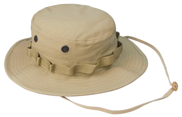
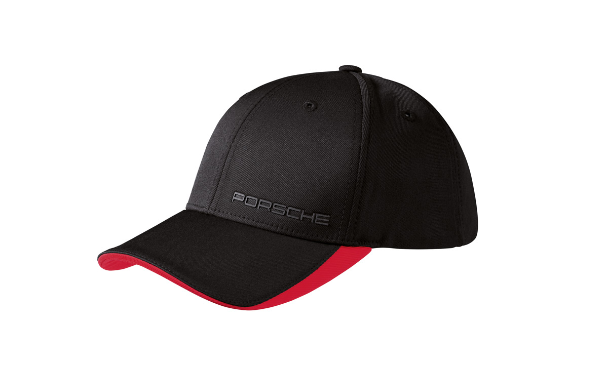
But I'm too old school to want one of the Millennials'-style hard structured hats with the dead flat bill as shown above, as I like my hats bills with a curve to keep the sun out of my eyes - not to look "Gangsta"!


Tom
///////

 I will get ahold of Sean and post back.