First, I'd like to thank Jeroen for this unsolicited art work.
Help me pick my new company logo.
I'm leaning toward the one on the top-left. It has a really good 'bowling shirt' quality that I like.
For our graphic artists, please feel free to contribute.
Full Version: Pick the new 'Series 9' logo.
reminds me of the "sector 9" longboards i own...

that being said... TOP LEFT
that being said... TOP LEFT
 TOP LEFT
  I also like the optical illusion that the numbers are shrinking as they get close to the 9.
2nd one from on the right.
The bottom right one is cool - but perhaps too dot-com boom.
The bottom right one is cool - but perhaps too dot-com boom.
| QUOTE (fiid @ Dec 12 2005, 05:29 PM) |
| 2nd one from on the right. The bottom right one is cool - but perhaps too dot-com boom. |
Bottom right'll get you a nice letter from Porsche, followed by a summons to the federal district court nearest you, which will cost you a bundle to formally answer (and there IS NO informal answer). Nice work, though. I'd have a difficult time picking one. The Cap'n
Top left or bottom left. Looks good, Joe!
| QUOTE (Cap'n Krusty @ Dec 12 2005, 06:45 PM) |
| Bottom right'll get you a nice letter from Porsche...... |
The word 'Porsche' will not be on my logo. I'm aware of the problems with that.
| QUOTE (914RS @ Dec 12 2005, 05:49 PM) | ||
The word 'Porsche' will not be on my logo. I'm aware of the problems with that. |
BTW, I've been there. PITA, to say the least. The Cap'n
Top left is good. Bottom left is my pick. Can I ask a newbie question? Is it your shop?
Chris
Chris
| QUOTE (ChicagoChris @ Dec 12 2005, 06:59 PM) |
| Top left is good. Bottom left is my pick. Can I ask a newbie question? Is it your shop? Chris |
It's my new shop. To make a long story short, I'm leaving my flying career to open a shop back home in Florida in mid-'07.
It looks like I'm going to have some pre-opening business while I'm still in NM, so I'm working on things like logos.
2nd one down on the left, but add a .com on the right hand side.
| QUOTE (914RS @ Dec 12 2005, 09:04 PM) | ||
It's my new shop. To make a long story short, I'm leaving my flying career to open a shop back home in Florida in mid-'07. It looks like I'm going to have some pre-opening business while I'm still in NM, so I'm working on things like logos. |
You are a pilot? Sweet. The P-car shop is cooler tho.
I'm all for the top left.
Buuuuut, I think maybe that much yellow is overwhelming... anyone agree?
And so I propose to you this image, or something similar:

Buuuuut, I think maybe that much yellow is overwhelming... anyone agree?
And so I propose to you this image, or something similar:
top left, but I like the top right also. try filling the letters with your yellow instead of white
Bernie
Bernie
Where in FLA? And is the shop a service shop or a goods place?
Chris
Chris
| QUOTE (ChicagoChris @ Dec 12 2005, 07:50 PM) |
| Where in FLA? And is the shop a service shop or a goods place? Chris |
Primarily fabrication and service.
Near Deland (between Orlando and Daytona on I-4).
I like the top left and the bottom right.
top left will be easier to spot in a crowd (brand recognition)
Btm Rt looks a lil "higher end"
All good choices, any will do great for a logo.
BJH
top left will be easier to spot in a crowd (brand recognition)
Btm Rt looks a lil "higher end"
All good choices, any will do great for a logo.
BJH
Aww hell... When in Rome!

Hmmm... does that style look familiar to anyone else? Reminds me of a TV station logo, but I can't put my finger on it...
| QUOTE |
| top left, but I like the top right also. try filling the letters with your yellow instead of white Bernie |
Hmmm... does that style look familiar to anyone else? Reminds me of a TV station logo, but I can't put my finger on it...
I was hoping you would say something loke that. I have friends in Orlando. He did own a 914. Got a bit over his head, so he sold it last year.
I won't be driving mine down just for service but congratulations on the shop.
Chris
I won't be driving mine down just for service but congratulations on the shop.
Chris
On repeat inspection... The second one down on the left with the double line in the circle. Clean, easily readable, and reminds me of numbers on a vintage race car.
Chris
Chris
Experimenting with it... Decided to combine two of them, and tweak a little bit:

| QUOTE (Tettster @ Dec 12 2005, 08:59 PM) |
| <font face="century gothic">Experimenting with it... Decided to combine two of them, and tweak a little bit: |
I like that. It's going on the short list.
So I took a poll with my friends about which one of mine they liked the best, and most said the middle one was the best--and someone suggested finishing the circle.
Even though I thought that wouldn't make it read as well, I figured it was worth a try:

Even though I thought that wouldn't make it read as well, I figured it was worth a try:
ad some red for a hint of german heritage
| QUOTE (Jeroen @ Dec 12 2005, 10:34 PM) |
| ad some red for a hint of german heritage |
NICE!
| QUOTE (Jeroen @ Dec 12 2005, 10:34 PM) |
| ad some red for a hint of german heritage |
You're up early. What is it, like 6:30?
| QUOTE (Tettster @ Dec 12 2005, 06:49 PM) |
| <font face="century gothic">I'm all for the top left. Buuuuut, I think maybe that much yellow is overwhelming... anyone agree? And so I propose to you this image, or something similar: <img src="http://www.914world.com/bbs2/uploads/blog-1134443790.jpg"> |
 but here's it w/ a slight mod
got a little carried away 
I think the font is hard to read at a glance and requires some concentration
Bernie
Bernie
font familiar? think flux capacitor & de lorean 
a bit NASCAR-ish 
Series 9:
Here's my contribution.
They all look great.
I don't care which one you choose.
Put me down for a size Medium shirt.
Unabhängiger Porsche Dienst
They all look great.
I don't care which one you choose.
Put me down for a size Medium shirt.
Unabhängiger Porsche Dienst
2nd one down on the left
but if your brick & mortar, don't put the dotcom on anything but the website related stuff.
looks cool.
but if your brick & mortar, don't put the dotcom on anything but the website related stuff.
looks cool.
| QUOTE (914RS @ Dec 13 2005, 06:39 AM) | ||
You're up early. What is it, like 6:30? |
More like up late
Actually, I didn't sleep at all

I would say bottom right. Just my 2 cents,but the black and gold and that style font looks like a spin off of the Pittsburgh Steelers! The bottom right has it own style an dlooks pretty unique! Thanks. 
| QUOTE (VegasRacer @ Dec 13 2005, 02:46 AM) |
| Here's my contribution. They all look great. :gerflag: I don't care which one you choose. Put me down for a size Medium shirt. Unabhängiger Porsche Dienst |
Ooh lala!
I like this one. More than mine.
Use this last one that he did and be done with it. It looks really sharp. I'll take one shirt. Large please. A hat and a sticker if you've got em.
I'm not German. And because I'm building these cars in the US, the way they should have been built (IMO), I'm going to stay away from the colors of the Fatherland.
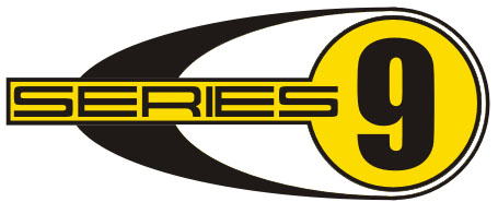
Here's the winner. Many thanks to Jeroen and Tettster (who says newbies can't contribute) .
.
The first items will be in these colors, but I'll likely switch and change colors for different applications in the future.
Do I need a high resolution version for stickers and embroidery?
Z! I need decals! Email me you punk-ass......
Here's the winner. Many thanks to Jeroen and Tettster (who says newbies can't contribute)
.The first items will be in these colors, but I'll likely switch and change colors for different applications in the future.
Do I need a high resolution version for stickers and embroidery?
Z! I need decals! Email me you punk-ass......
| QUOTE (Tettster @ Dec 12 2005, 06:58 PM) | ||
<font face="century gothic">Aww hell... When in Rome!
|
i think you may refer to this one

I really liked the black red and yellow logo. A nice touch!
Good luck with the shop!!
-Josh2
Good luck with the shop!!
-Josh2
I've got Z working on decals.
Half will have the white background 'built in' to the decal and half will have nothing where you see white, so you can put the decal on any color you want and have that color come through in place of the white.
?entiendes?
Half will have the white background 'built in' to the decal and half will have nothing where you see white, so you can put the decal on any color you want and have that color come through in place of the white.
?entiendes?
| QUOTE (914RS @ Dec 13 2005, 11:12 AM) |
Here's the winner. Many thanks to Jeroen and Tettster (who says newbies can't contribute) . |
Tettster is my fifteen-and-a-half year old son, Joe.
Shouldn't you send the boy a free shirt for the consult?

John

P.S. The boy has 'puter skillz

| QUOTE (Flat VW @ Dec 13 2005, 05:01 PM) |
| Shouldn't you send the boy a free shirt for the consult? |
No shirts yet, but a free decal will be on the way as soon as Z is done.
Hats will be next, he can probably expect one of those as well.
| QUOTE (914RS @ Dec 13 2005, 05:06 PM) | ||
No shirts yet, but a free decal will be on the way as soon as Z is done. Hats will be next, he can probably expect one of those as well. |

I have to say, free items do sound completely gnarly..

Maybe now I can put something on my resumé for a graphic designing career! Whooooh!
| QUOTE (914RS @ Dec 13 2005, 04:06 PM) | ||
No shirts yet, but a free decal will be on the way as soon as Z is done. Hats will be next, he can probably expect one of those as well. |
What a guy!
You are the FIRST guy I am calling next time I am locked out of my car in New Mexico....
Do you serve the ENTIRE state?
Faywood Hot Springs?

John

| QUOTE (Tettster @ Dec 13 2005, 05:11 PM) |
| Maybe now I can put something on my resumé for a graphic designing career! Whooooh! |
You type it up on your resume' any way you like, I'll field the phone calls.
One of the absolute best things about this club is that we have no shortage of diverse talent. I really appreciate the help I've received and don't hesitate to return it.
| QUOTE (Flat VW @ Dec 13 2005, 05:16 PM) |
| You are the FIRST guy I am calling next time I am locked out of my car in New Mexico.... |
You probably wouldn't like my solution to gaining entry easily. It involves a hammer and an unfortunate quarter-window.
They take about five minutes to replace and are virtually free to club members....
| QUOTE (914RS @ Dec 13 2005, 04:27 PM) |
| You probably wouldn't like my solution to gaining entry easily. It involves a hammer and an unfortunate quarter-window. |
No, you are right, I would not have liked that......
If you ever need to get in one thru the "keyhole" though,
I have the experience.......not a mark.....
John

Here's the first sewout. White will be in the field on the hats.
This is a "lo-fi" version of our main content. To view the full version with more information, formatting and images, please click here.