Full Version: Engman Parts Logo Poll
Thank you SEan for the too many choices.
Thats why there is a poll.
Sean is just too damn good.

M
Thats why there is a poll.
Sean is just too damn good.
M
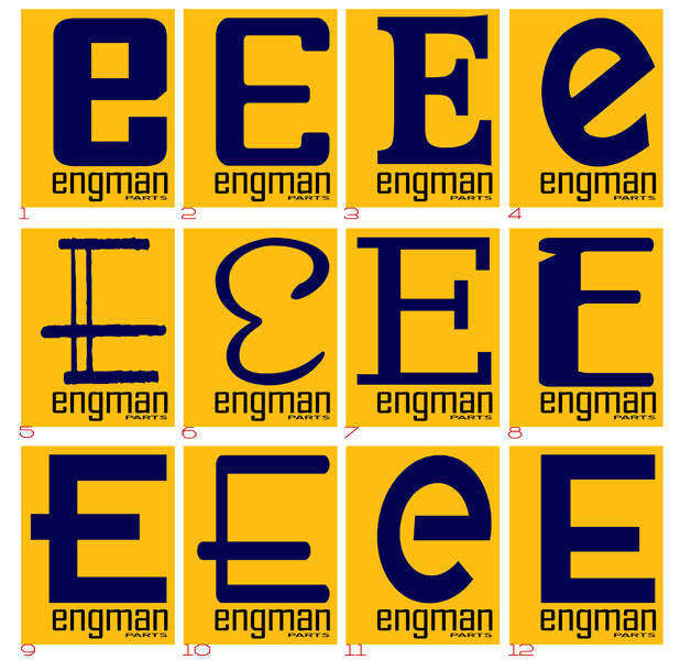
I like #5. It has the most "fabricated" look to it, which fits well with the theme IMO. Cool!
11 is kinda like a transposed "9". Kinda like it for that reason.
I voted for number two. 
What about a backwards 9 in the porsche logo?
What does the Porsche script "E" look like as in 911E?
vote for #6
Number four, definitely, unique enough but still 'reads' well.
John
P.S. The poll looks like some funky eye chart.
John
P.S. The poll looks like some funky eye chart.
#1 'e' is the same as the e's in engman?
How about putting 'ngman' inside the big 'e'? A little squeezing and it will fit. Im not good enough at photoshop to try it.
SMD
How about putting 'ngman' inside the big 'e'? A little squeezing and it will fit. Im not good enough at photoshop to try it.
SMD
What about  ??
??
??
#4...just like it most...more contemporary than others.
#10 because it looks like an end mill.
whichever is chosen, please email me a e-file to add to my SEMA sticker...
whichever is chosen, please email me a e-file to add to my SEMA sticker...
No question (for me) -- 1's the one.
Matches the type below it and just looks simply great. Colors, shape, whole thing. I just really dig it.
Would also like to see the idea in the "Porsche" E for brand recognition, but I really, really LOVE #1. (did I mention that?)
TIFWIW...
pete
Matches the type below it and just looks simply great. Colors, shape, whole thing. I just really dig it.
Would also like to see the idea in the "Porsche" E for brand recognition, but I really, really LOVE #1. (did I mention that?)
TIFWIW...
pete

#1
Repeats the letter style, mirrored 9, I like it.
QUOTE(Rand @ Aug 15 2006, 12:01 PM) 
I like #5. It has the most "fabricated" look to it, which fits well with the theme IMO. Cool!
But I like Number one as well.
Either way, the stuff you make is great!

Would it be rude to make a completely alternative suggestion?
QUOTE(jasons @ Aug 15 2006, 05:18 PM)
Would it be rude to make a completely alternative suggestion?
Hmmm... I agree....
Doesn't Engman do a lot of stuff with laser cutting? Would be neat to have a laser cutting out part of the E?
Maybe use a font similar to the E in PORSCHE...
Nice designs... I can't decide...
How about on with part of the E rusting away... or an E on jackstands?
QUOTE(balljoint @ Aug 15 2006, 01:47 PM)
#1
Repeats the letter style, mirrored 9, I like it.
my vote also.
QUOTE(turboman808 @ Aug 15 2006, 11:07 AM)
What about a backwards 9 in the porsche logo?
I like turbomans.
# 8 It attracted my eye, isn't that what you want from a sign.
I voted for #4 but thought if it was rotated the other way it would look "faster", the way it is shows me "torque". If that makes any sense. But I also like #1.
I want to thank everyone for voting! This really means a lot to me.
I especially appreciate the artistic eye Sean and the club have given this.
I would not have my lil business without everyone here.
Thank you all
Oh - the voting is not over until Sean goes to bed!
Mark
I especially appreciate the artistic eye Sean and the club have given this.
I would not have my lil business without everyone here.
Thank you all
Oh - the voting is not over until Sean goes to bed!
Mark
Thanks for voting everyone...I've got a shirt I need to get out, so if Mark agrees #1 looks to be the winner...and I'll get the shirt out to the printer tomorrow for the SEC.
QUOTE(balljoint @ Aug 15 2006, 01:47 PM)
#1
Repeats the letter style, mirrored 9, I like it.
My thoughts, exactly. . . .
I voted for #8... it looks like the most "milled" piece to my eye.
-Rusty
-Rusty
Thanks to everyone and Seanery in particular - a new avatar has been chosen
This is a "lo-fi" version of our main content. To view the full version with more information, formatting and images, please click here.