QUOTE
Didn't you forget mine???

Sorry, Clay. Missed your link. I fixed it, okay?? You're up there.
QUOTE
Am I missing a way to click on each entry to check the load time?
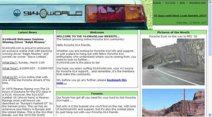
Paul... no, there really isn't. Most folks just captured a screen shot of their design. I posted what folks submitted... and didn't get too wrapped up about it.
QUOTE
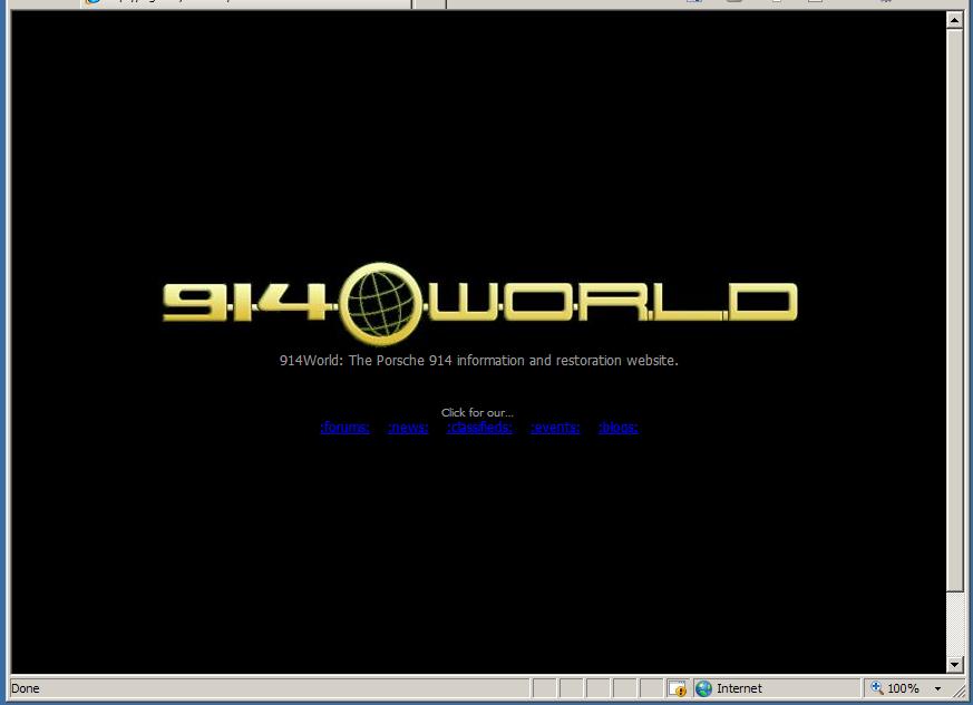
And please have a log-in button on the very first page!
I like that idea, but I think that violates Andy's imposed limitation that the front page will not access any of the Forum databases. My guess is that it's a security thing. Andy will correct me if I'm wrong, of course.

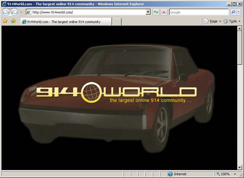


 .
. 


 but I kind of like it


 !
!

 Andy
Andy