|
|
|
Porsche, and the Porsche crest are registered trademarks of Dr. Ing. h.c. F. Porsche AG.
This site is not affiliated with Porsche in any way. Its only purpose is to provide an online forum for car enthusiasts. All other trademarks are property of their respective owners. |
|
|

  |

| brant |
 Aug 1 2006, 09:09 PM Aug 1 2006, 09:09 PM
Post
#41
|
|
914 Wizard  Group: Members Posts: 11,623 Joined: 30-December 02 From: Colorado Member No.: 47 Region Association: Rocky Mountains |
holey moley..
thanks for doing so much work Jeroen! that looks awesome! mikes "evil works" looks awesome. are his and spunone the ones you created from scratch? brant |
   |

 
|
| TINCAN914 |
Aug 1 2006, 11:00 PM
Post
#42
|
|
Summer's Commin... Group: Members Posts: 2,440 Joined: 18-August 05 From: Colorado Springs, CO. Member No.: 4,611 Region Association: Rocky Mountains |
Evil werks is killer!!! I want a shirt with just his logo on it...
Awesome work Jeroen.. My vote all logo's on the back.. I hate stuff on the front.. Just my vote. Can you have the sponsors around the RRC logo? You can remove Team NARP, unless someone else talked with him? I never heard back from him regarding donations... Also if were going to put the badge on the front, do we need it on the back..? That removes two, so it will free up some space.. |
|
|
|
| Jeroen |
Aug 2 2006, 04:18 AM
Post
#43
|
|
914 Guru Group: Members Posts: 7,887 Joined: 24-December 02 From: The Netherlands Member No.: 3 Region Association: Europe |
John told me Team Narp was in...
Lemme know if they're not Yep, EvilWerks and SpunOne are made from scratch They don't know what they'll get yet I'll be back on saturday, so you've got some time to decide I'll wrap things up when I get back and send it to John |
|
|
|
| VegasRacer |
Aug 2 2006, 06:45 AM
Post
#44
|
|
ELVIRA Group: Benefactors Posts: 8,507 Joined: 27-March 03 From: Between Scylla and Charybdis Member No.: 481 Region Association: None |
That looks spectacular Jeroen. (IMG:style_emoticons/default/clap56.gif)
(damn, that sure is a shit load of sponsor logos) (IMG:style_emoticons/default/w00t.gif) I think it is to much to have all the sponsors and the RRC logo on the back. I vote for just the sponsors on the back. QUOTE we can do the sponsors in b/w to save some bucks Yes, we could save money if we did the sponsors in one color, but I think it looks great in red / black. I think a better way is to offer the best looking shirt possible so more people will purchase one. The more I sell, the lower the cost per shirt. If we go with only the sponsors on the back, we should put some version of the RRC logo on the front instead of the new Club badge (since it is already going to be on the back). A.) The RRC logo full size on the front. 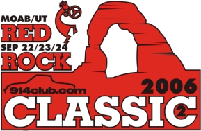 B.) The full RRC logo pocket size on one breast. C.) A partial RRC logo on the breast 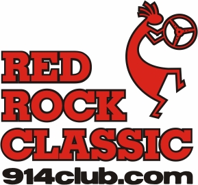 OR OR 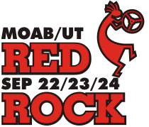 OR (IMG:style_emoticons/default/confused24.gif) OR (IMG:style_emoticons/default/confused24.gif) D.) Other ideas? ? ? (IMG:style_emoticons/default/wavey.gif) Yes, I was the one who told Jeroen to add the Team NARP logo. If anyone has a problem with that - send me a PM. They are the official supplier of Cazadores for the Red Rock Classic. I don't have anything to report on the style / color for shirt selection. The shrunken sleeves are a concern with my original choice. I will have more to report in a day or two. I want to go public with the *official order thread* by this weekend. |
|
|
|
| TROJANMAN |
Aug 2 2006, 09:12 AM
Post
#45
|
|
Looks nice in pictures......... Group: Members Posts: 5,270 Joined: 5-March 04 From: Colorado Member No.: 1,753 Region Association: None |
because the sponsors are going to have such a large display on the shirts, do you think it would be appropriate to ask for them to subsudize the cost? (IMG:style_emoticons/default/idea.gif) I believe the 914club sponsor shirts that Seanery was making were being subsidized by said sponsors, which is why they were quite a bit cheaper
just an idea....... (IMG:style_emoticons/default/smile.gif) |
|
|
|
| TINCAN914 |
Aug 2 2006, 09:43 AM
Post
#46
|
|
Summer's Commin... Group: Members Posts: 2,440 Joined: 18-August 05 From: Colorado Springs, CO. Member No.: 4,611 Region Association: Rocky Mountains |
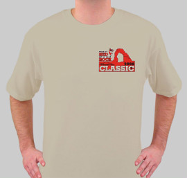
QUOTE(VegasRacer @ Aug 2 2006, 04:45 AM)  That looks spectacular Jeroen. (IMG:style_emoticons/default/clap56.gif) (damn, that sure is a shit load of sponsor logos) (IMG:style_emoticons/default/w00t.gif) I think it is to much to have all the sponsors and the RRC logo on the back. I vote for just the sponsors on the back. QUOTE we can do the sponsors in b/w to save some bucks Yes, we could save money if we did the sponsors in one color, but I think it looks great in red / black. I think a better way is to offer the best looking shirt possible so more people will purchase one. The more I sell, the lower the cost per shirt. If we go with only the sponsors on the back, we should put some version of the RRC logo on the front instead of the new Club badge (since it is already going to be on the back). A.) The RRC logo full size on the front. B.) The full RRC logo pocket size on one breast. C.) A partial RRC logo on the breast OR OR (IMG:style_emoticons/default/confused24.gif) D.) Other ideas? ? ? (IMG:style_emoticons/default/wavey.gif) Yes, I was the one who told Jeroen to add the Team NARP logo. If anyone has a problem with that - send me a PM. They are the official supplier of Cazadores for the Red Rock Classic. I don't have anything to report on the style / color to report for shirt selection. The shrunken sleeves are a concern with my original choice. I will have more to report in a day or two. I want to go public with the *official order thread* by this weekend. Ok John my bad. (IMG:style_emoticons/default/smile.gif) I didn't hear back from Joe, so I wasn't sure if they were in or not. (IMG:style_emoticons/default/clap56.gif) I say the full RRC logo on the breast. |
|
|
|
| Eric_Shea |
Aug 2 2006, 04:36 PM
Post
#47
|
|
PMB Performance Group: Admin Posts: 19,275 Joined: 3-September 03 From: Salt Lake City, UT Member No.: 1,110 Region Association: Rocky Mountains |
QUOTE salmon would be down right hialrious (IMG:style_emoticons/default/dry.gif)Actually, a lot of the cool Moab shirts you see in the shops down there are a kind of stone washed rust color that matches the rocks. Jeroen, would it be a quick Photoshop exercise to pull the color out of one of the photographs and match it? Might be cool (IMG:style_emoticons/default/confused24.gif) |
|
|
|
| TROJANMAN |
Aug 2 2006, 10:06 PM
Post
#48
|
|
Looks nice in pictures......... Group: Members Posts: 5,270 Joined: 5-March 04 From: Colorado Member No.: 1,753 Region Association: None |
QUOTE(Eric_Shea @ Aug 2 2006, 02:36 PM) QUOTE salmon would be down right hialrious (IMG:style_emoticons/default/dry.gif)Actually, a lot of the cool Moab shirts you see in the shops down there are a kind of stone washed rust color that matches the rocks. don't get mad at me for that one. (IMG:style_emoticons/default/dry.gif) QUOTE(VegasRacer @ Jul 26 2006, 05:46 AM) (IMG:style_emoticons/default/idea.gif) . . . . or we could do the shirts in Cardinal and Gold. (IMG:style_emoticons/default/wink.gif) . . or |
|
|
|
| VegasRacer |
Aug 4 2006, 01:33 PM
Post
#49
|
|
ELVIRA Group: Benefactors Posts: 8,507 Joined: 27-March 03 From: Between Scylla and Charybdis Member No.: 481 Region Association: None |
I spoke with my contact regarding the short sleeves and the organic shirt.
She said it is a styling thing. You know . . . very popular with hip teenagers. Sooo . . . back to the traditional style for us vintage fogies. (IMG:style_emoticons/default/cool.gif) Pick One: Natural. 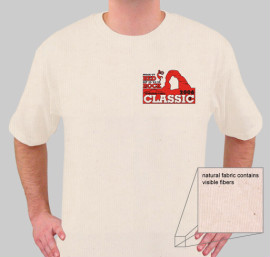 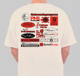 Ash. 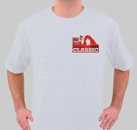 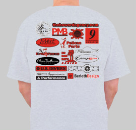 Haze. 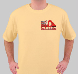 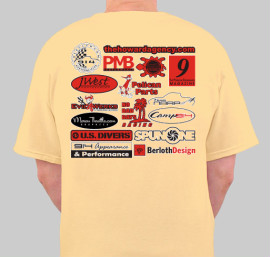 Sand.  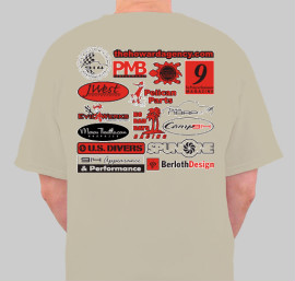 |
|
|
|
| TROJANMAN |
Aug 4 2006, 02:41 PM
Post
#50
|
|
Looks nice in pictures......... Group: Members Posts: 5,270 Joined: 5-March 04 From: Colorado Member No.: 1,753 Region Association: None |
can i throw in two cents?
I think the sponsor idea is cool, but it is a little over whelming. I mean, it is supposed to be an "event" Tshirt, not a billboard. Ok, maybe that was a nickel's worth. sorry (IMG:style_emoticons/default/dry.gif) |
|
|
|
| brant |
Aug 4 2006, 03:24 PM
Post
#51
|
|
914 Wizard Group: Members Posts: 11,623 Joined: 30-December 02 From: Colorado Member No.: 47 Region Association: Rocky Mountains |
you asked...
my opinion in this order: sand, natural, ash, and last is haze... only my opinion. but the red looks really nice against the sand. brant |
|
|
|
| VegasRacer |
Aug 4 2006, 03:25 PM
Post
#52
|
|
ELVIRA Group: Benefactors Posts: 8,507 Joined: 27-March 03 From: Between Scylla and Charybdis Member No.: 481 Region Association: None |
Yeah. (IMG:style_emoticons/default/agree.gif) Jeroen's graphic turned out to be a helluva lot more than I expected. (IMG:style_emoticons/default/blink.gif) I would hate for his efforts to be in vein. It is appropriate to thank the vendors who donated, but they aren't really sponsors of the event. Lemme see what I can work up. It can't be to small or you won't be able to tell what the logos are.
More comments please. (IMG:style_emoticons/default/confused24.gif) What color for the shirts? If we are doing red/black on the back we can do a different color combination of the front if we want. Suggestions? Should we stick with the full event graphic on the front? |
|
|
|
| VegasRacer |
Aug 4 2006, 03:27 PM
Post
#53
|
|
ELVIRA Group: Benefactors Posts: 8,507 Joined: 27-March 03 From: Between Scylla and Charybdis Member No.: 481 Region Association: None |
Sand is also my 1st choice. Natural is 2nd. (IMG:style_emoticons/default/smilie_flagge24.gif)
|
|
|
|
| Jeroen |
Aug 4 2006, 06:14 PM
Post
#54
|
|
914 Guru Group: Members Posts: 7,887 Joined: 24-December 02 From: The Netherlands Member No.: 3 Region Association: Europe |
Been outta town for a couple a days... but I'm back now (IMG:style_emoticons/default/biggrin.gif)
What you can do with the sponsors: Contact them if they want their logo on the shirt If so, they pay extra If not, we only print their name on the shirt (text only, all in the same font, alphabetical order) If you do the logo's on the back and the RRC logo on front, I do the front full size, not pocket sized, otherwise the shirt will be (even) more of a billboard instead of an event shirt... Just my 2 cents... (oh, and don't worry about the work I got into the shirt/logo's, those will come in handy at one time or another) |
|
|
|
| VegasRacer |
Aug 4 2006, 06:45 PM
Post
#55
|
|
ELVIRA Group: Benefactors Posts: 8,507 Joined: 27-March 03 From: Between Scylla and Charybdis Member No.: 481 Region Association: None |
What about something this for the back with some sort of limited RRC logo on the front breast?
 I don't think it would be fair to change the rules now and go back and ask the sponsors for money. |
|
|
|
| VegasRacer |
Aug 4 2006, 07:00 PM
Post
#56
|
|
ELVIRA Group: Benefactors Posts: 8,507 Joined: 27-March 03 From: Between Scylla and Charybdis Member No.: 481 Region Association: None |
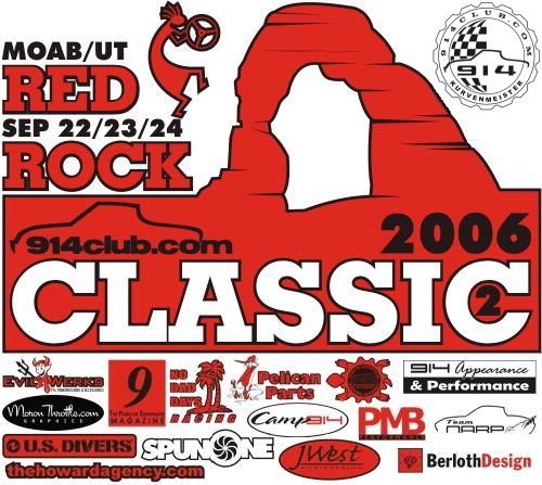
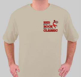
Front
except maybe in blue and red for variety Attached image(s) 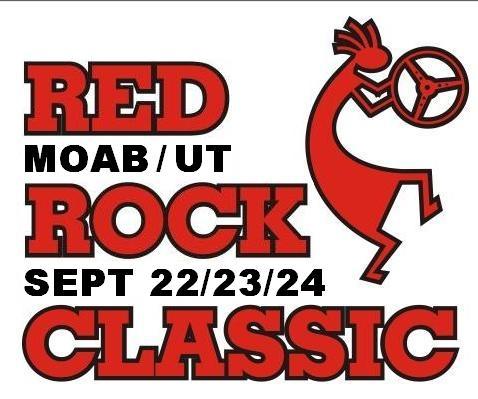
|
|
|
|
| VegasRacer |
Aug 4 2006, 07:16 PM
Post
#57
|
|
ELVIRA Group: Benefactors Posts: 8,507 Joined: 27-March 03 From: Between Scylla and Charybdis Member No.: 481 Region Association: None |
Jeroen - My latest graphic for the back is unbalanced. I am confident you can find a better arrangement. Also, with it reduced there might be a problem with the Turtle logo (like we had with Iron Horse on the WCC plates). Can you reverse the text in the center so it has better contrast.
Do you have any good ideas for the front. More planners have said they liked the breast pocket logo on the front instead of something full size. Sorta like this (my .jpg's are to dirty to get a better image)  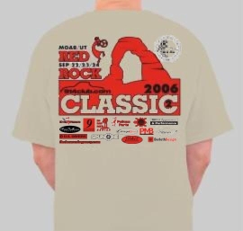 Talk to me! (IMG:style_emoticons/default/slap.gif) I'm getting tired of fuchin' with it. |
|
|
|
| VegasRacer |
Aug 4 2006, 09:42 PM
Post
#58
|
|
ELVIRA Group: Benefactors Posts: 8,507 Joined: 27-March 03 From: Between Scylla and Charybdis Member No.: 481 Region Association: None |
compare
  |
|
|
|
| VegasRacer |
Aug 5 2006, 06:14 AM
Post
#59
|
|
ELVIRA Group: Benefactors Posts: 8,507 Joined: 27-March 03 From: Between Scylla and Charybdis Member No.: 481 Region Association: None |
Jeroen - Is it to late to add one more sponsor logo (in addition to or in place of the Porsche crest). John (jgara962) has offered to send some wine from The Delicato Family Vineyards. See page 18 and 19 of this RRC thread.
You da Man. (IMG:style_emoticons/default/smiley_notworthy.gif) (IMG:http://www.dcu.ie/alumni/spring04/images/vineyard_Logo.jpg) |
|
|
|
| Jeroen |
Aug 5 2006, 07:15 AM
Post
#60
|
|
914 Guru Group: Members Posts: 7,887 Joined: 24-December 02 From: The Netherlands Member No.: 3 Region Association: Europe |
John, can you ask them if they have their logo in .eps .ai or .pdf format?
That would save me a ton of work... I'll look into the Turtle Mountain logo Let's not take our chances on the Porsche Crest... |
|
|
|
|
1 User(s) are reading this topic (1 Guests and 0 Anonymous Users)
0 Members:

|
Lo-Fi Version | Time is now: 13th May 2024 - 09:02 PM |
Invision Power Board
v9.1.4 © 2024 IPS, Inc.