|
|
|
Porsche, and the Porsche crest are registered trademarks of Dr. Ing. h.c. F. Porsche AG.
This site is not affiliated with Porsche in any way. Its only purpose is to provide an online forum for car enthusiasts. All other trademarks are property of their respective owners. |
|
|

  |

| cbenitah |
 Sep 2 2006, 06:25 PM Sep 2 2006, 06:25 PM
Post
#1
|
|
Protected by the Swedish Maffia  Group: Members Posts: 848 Joined: 16-August 05 From: San Diego, CA Member No.: 4,597 |
I have been looking at these for a while now and can't make up my mind.. They ar going to be a flyer you hand out. . . .
Thankful for various input. . . .  |
   |

 
|
| cbenitah |
Sep 2 2006, 06:26 PM
Post
#2
|
|
Protected by the Swedish Maffia Group: Members Posts: 848 Joined: 16-August 05 From: San Diego, CA Member No.: 4,597 |
hmm
Attached thumbnail(s) 
|
|
|
|
| HeloMech |
Sep 2 2006, 06:30 PM
Post
#3
|
|
Go Ahead, Get Pistoph! Group: Members Posts: 691 Joined: 31-August 05 From: Roy, WA Member No.: 4,718 Region Association: Southern California |
I voted for the horizontal.
The vertical is a little more appealing as far as being suggestive.. maybe more appealing to guys. The horizontal, however, is better at getting the information across in a cleaner format and still interesting with it's layout. My 2 cents. |
|
|
|
| cbenitah |
Sep 2 2006, 06:34 PM
Post
#4
|
|
Protected by the Swedish Maffia Group: Members Posts: 848 Joined: 16-August 05 From: San Diego, CA Member No.: 4,597 |
thanks HeloMech,
I spent more time on it as well... |
|
|
|
| anthony |
Sep 2 2006, 07:48 PM
Post
#5
|
|
2270 club Group: Benefactors Posts: 3,107 Joined: 1-February 03 From: SF Bay Area, CA Member No.: 218 |
I like the colors on the first one but I find the graphic of the body weird and distracting - like the peninsulas extending out from the legs under "September 29".
|
|
|
|
| KaptKaos |
Sep 2 2006, 08:02 PM
Post
#6
|
|
Family Group: Members Posts: 4,009 Joined: 23-April 03 From: Near Wausau Member No.: 607 Region Association: Upper MidWest |
In the vertical one, the K in weekend makes the girl look like she has a camel toe.
Aside from that, I don't understand the point of view for the second one. Seems like its the back of a station wagon view. They are both cool tho. Nice work. |
|
|
|
| cbenitah |
Sep 2 2006, 08:07 PM
Post
#7
|
|
Protected by the Swedish Maffia Group: Members Posts: 848 Joined: 16-August 05 From: San Diego, CA Member No.: 4,597 |
you are looking through a window inside a car and next to you there is another car..
thanks (at least no one said that I should move home) (IMG:style_emoticons/default/laugh.gif) |
|
|
|
| Allan |
Sep 2 2006, 10:19 PM
Post
#8
|
|
Teenerless Weenie Group: Members Posts: 8,373 Joined: 5-July 04 From: Western Mesopotamia Member No.: 2,304 Region Association: Southern California |
WTF are these? Was it a realy fat girl that still has the excess skin on the inside of her thighs? (IMG:style_emoticons/default/blink.gif)
Attached thumbnail(s) 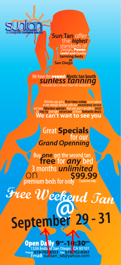
|
|
|
|
| Tettster |
Sep 2 2006, 10:29 PM
Post
#9
|
|
Member Group: Members Posts: 99 Joined: 8-November 05 Member No.: 5,089 Region Association: None |
Her feet tucked under her, right? She's on her knees.
|
|
|
|
| Aaron Cox |
Sep 2 2006, 10:31 PM
Post
#10
|
|
Professional Lawn Dart Group: Retired Admin Posts: 24,541 Joined: 1-February 03 From: OC Member No.: 219 Region Association: Southern California |
perfect height then..... (IMG:style_emoticons/default/smile.gif)
anyway... if she is on her knees, what are the big blobs at her knees? |
|
|
|
| Qarl |
Sep 2 2006, 10:52 PM
Post
#11
|
|
Shriveled member Group: Benefactors Posts: 5,233 Joined: 8-February 03 From: Florida Member No.: 271 Region Association: None |
I find the font shifts very distracting. italics, straight, bolt, white, black... too much shifting throughout.
|
|
|
|
| SGB |
Sep 2 2006, 11:37 PM
Post
#12
|
|
just visiting Group: Members Posts: 4,086 Joined: 8-March 03 From: Huntsville, AL Member No.: 404 Region Association: South East States |
I agree with Karl about the fonts. The top one needs a blocky easily read font to stand out from the girl, I prefer the second - carwindow effect - one. At first I thought it was sunglasses. That would work. Also, they both have too much unformation. It is a big commitment to ask of a reader- make it easy on the eyes and brain....
|
|
|
|
| cbenitah |
Sep 3 2006, 05:04 AM
Post
#13
|
|
Protected by the Swedish Maffia Group: Members Posts: 848 Joined: 16-August 05 From: San Diego, CA Member No.: 4,597 |
guys, all the info on the flyers need t o be there. Client told me so.
I like the window one.. i understand sbout the fonts, but to get the desired effect one needs t o add more interest for the viewer when its as much info as it is.. thanks for input though 2 swedish girls in the other room and im on the club site (IMG:style_emoticons/default/WTF.gif) |
|
|
|
| balljoint |
Sep 3 2006, 06:01 AM
Post
#14
|
|
914 Wizard Group: Members Posts: 10,000 Joined: 6-April 04 Member No.: 1,897 Region Association: None |
Forget the shape of the girl for a second and look at the shape of the blue area between her legs. (IMG:style_emoticons/default/blink.gif)
I think it looks like Dean Cain. (IMG:style_emoticons/default/smile.gif) Nice work. |
|
|
|
| Qarl |
Sep 3 2006, 08:21 AM
Post
#15
|
|
Shriveled member Group: Benefactors Posts: 5,233 Joined: 8-February 03 From: Florida Member No.: 271 Region Association: None |
As a graphics guy, you should tell your client there is too much info on the ad.
I can think of two or three sentences that aren't critical to the ad. I dont' agree that the changes in fonts adds interest. Between the odd shapes and the every-changing fonts, I get a headache. Maybe I'm just turning into an old fart. You asked for input, I'm just being honest. Okay... here some more feedback... Free Weekend Tan "@" September 29-31? @ = at, right? Reads... Free Weekend Tan "at" September 29-31st... doesn't make sense to me? Also... and here it comes... There are only 30 days in September? Thank you... now where's my prize? (IMG:style_emoticons/default/biggrin.gif) Otherwise I like #2.... Can you angle the fonts a little to coincide with the angle of the window? |
|
|
|
| cbenitah |
Sep 3 2006, 04:05 PM
Post
#16
|
|
Protected by the Swedish Maffia Group: Members Posts: 848 Joined: 16-August 05 From: San Diego, CA Member No.: 4,597 |
I told him several times that it is to much info, the ad is only 4.75*10 which is not much space and an ackward size..
Sept 31st haha, I didnt look, I just took the text he provided me.. Free Weekend Tan does not make sense to me, but since english is not my first language I dont know.. I was thinking about that so it reads better.. But not sure, I will try though. Thanks for all the feedback.. Back to work again I guess.. Give me a while an I'll post the changes |
|
|
|
| alpha434 |
Sep 3 2006, 04:24 PM
Post
#17
|
|
My member number is no coincidence. Group: Members Posts: 3,154 Joined: 16-December 05 From: Denver, CO Member No.: 5,280 Region Association: Rocky Mountains |
Move back to sweden, and get back with the supermodel.
Remember, your client's input is more important than ours. bring in both pictures and ask him which one he likes. I the crap doesn't sell, then it's not your problem. You're just the graphics guy, not his marketing director. |
|
|
|
| JPB |
Sep 3 2006, 07:39 PM
Post
#18
|
|
The Crimson Rocket smiles in your general direction. Group: Members Posts: 2,927 Joined: 12-November 05 From: Tapmahamock, Va. Member No.: 5,107 |
GRAND OPENING needs to be relocated over the cooch area, thank you.
(IMG:style_emoticons/default/beer.gif) Hello! |
|
|
|
| SGB |
Sep 3 2006, 08:32 PM
Post
#19
|
|
just visiting Group: Members Posts: 4,086 Joined: 8-March 03 From: Huntsville, AL Member No.: 404 Region Association: South East States |
QUOTE(JPB @ Sep 3 2006, 08:39 PM)  GRAND OPENING needs to be relocated over the cooch area, thank you. (IMG:style_emoticons/default/beer.gif) Hello! (IMG:style_emoticons/default/beerchug.gif) an EXCELLENT idea. places all our other complaints in perspective. Truely. Sex is used to sell EVERYTHING. I think that is because it works. (IMG:style_emoticons/default/smile.gif) Also could say "FREE" in big letters across the region of focus. |
|
|
|
| Qarl |
Sep 3 2006, 10:35 PM
Post
#20
|
|
Shriveled member Group: Benefactors Posts: 5,233 Joined: 8-February 03 From: Florida Member No.: 271 Region Association: None |
Perhaps the silhouette in the top is giving birth.. and the things between her thighs are baby's legs...
... nah! That would be gross! (IMG:style_emoticons/default/confused24.gif) |
|
|
|
|
1 User(s) are reading this topic (1 Guests and 0 Anonymous Users)
0 Members:

|
Lo-Fi Version | Time is now: 15th May 2024 - 02:41 PM |
Invision Power Board
v9.1.4 © 2024 IPS, Inc.