|
|
|
Porsche, and the Porsche crest are registered trademarks of Dr. Ing. h.c. F. Porsche AG.
This site is not affiliated with Porsche in any way. Its only purpose is to provide an online forum for car enthusiasts. All other trademarks are property of their respective owners. |
|
|

  |

| dlo914 |
 Oct 12 2006, 06:19 PM Oct 12 2006, 06:19 PM
Post
#1
|
|
Whatchu' lookin' at?!?!  Group: Members Posts: 3,432 Joined: 6-September 04 From: San Gabriel, CA Member No.: 2,697 |
So for "Introduction to Graphic Designs & Advertising" we just got assigned a new project to advertise a car and make a billboard ad campaign consisting of 4 ads total. I've done two so far. I'm going w/ the "Sheep in wolf's clothing" for the new VW GTi.
Attached image(s) 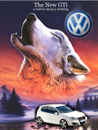 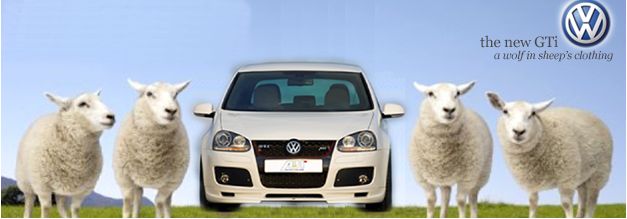
|
   |

 
|
| dlo914 |
Oct 12 2006, 06:22 PM
Post
#2
|
|
Whatchu' lookin' at?!?! Group: Members Posts: 3,432 Joined: 6-September 04 From: San Gabriel, CA Member No.: 2,697 |
and another idea i was toying around with (IMG:style_emoticons/default/biggrin.gif)
Attached image(s) 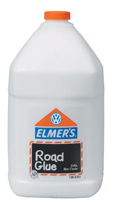
|
|
|
|
| dlo914 |
Oct 12 2006, 07:02 PM
Post
#3
|
|
Whatchu' lookin' at?!?! Group: Members Posts: 3,432 Joined: 6-September 04 From: San Gabriel, CA Member No.: 2,697 |
3rd ad from the "Sheep in wolf's clothing" campaign:
Attached image(s) 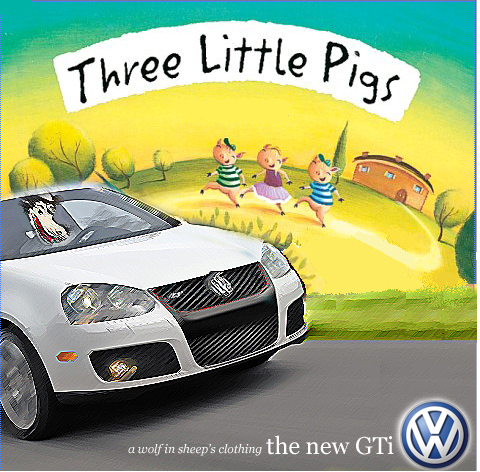
|
|
|
|
| McMark |
Oct 12 2006, 07:09 PM
Post
#4
|
|
914 Freak! Group: Retired Admin Posts: 20,179 Joined: 13-March 03 From: Grand Rapids, MI Member No.: 419 Region Association: None |
HEY! I made a RoadGlue image too!! (IMG:style_emoticons/default/mueba.gif)
Attached image(s) 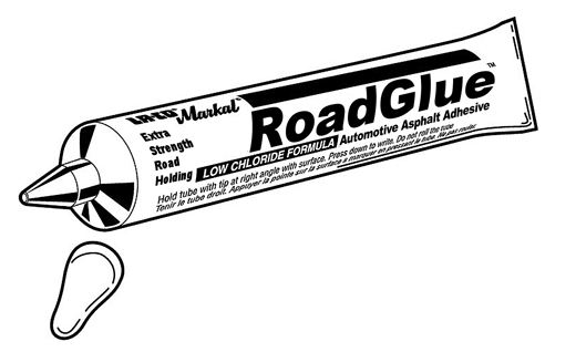
|
|
|
|
| dlo914 |
Oct 12 2006, 07:11 PM
Post
#5
|
|
Whatchu' lookin' at?!?! Group: Members Posts: 3,432 Joined: 6-September 04 From: San Gabriel, CA Member No.: 2,697 |
QUOTE(McMark @ Oct 12 2006, 06:09 PM)  (IMG:style_emoticons/default/chairfall.gif) i like your's better, but i think im onto something w/ the "sheep in wolf's clothing" lets just hope my professor thinks the same. (IMG:style_emoticons/default/blink.gif) |
|
|
|
| jd74914 |
Oct 12 2006, 07:18 PM
Post
#6
|
|
Its alive Group: Members Posts: 4,780 Joined: 16-February 04 From: CT Member No.: 1,659 Region Association: North East States |
i like the one with the sheep (IMG:style_emoticons/default/clap56.gif)
|
|
|
|
| Tobra |
Oct 12 2006, 08:08 PM
Post
#7
|
|
Senior Member Group: Members Posts: 1,453 Joined: 22-August 05 From: Sacramento, CA Member No.: 4,634 |
Favorite VW ad ever, she has a tat of a bunny there, just not that style
Front cover was the girls looking out the window 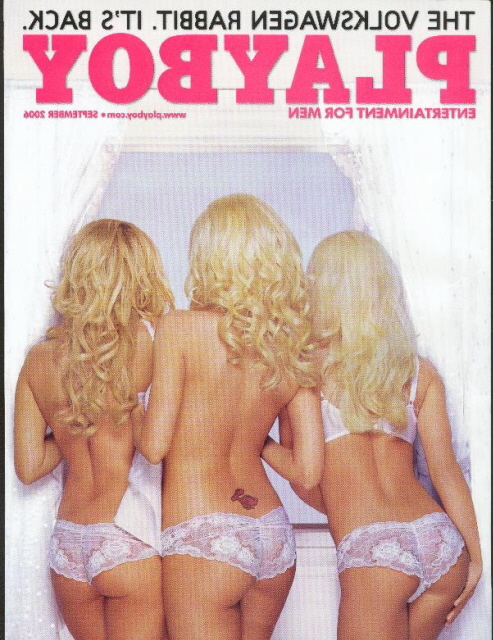 |
|
|
|
| dlo914 |
Oct 12 2006, 08:20 PM
Post
#8
|
|
Whatchu' lookin' at?!?! Group: Members Posts: 3,432 Joined: 6-September 04 From: San Gabriel, CA Member No.: 2,697 |
ive seen that one before (IMG:style_emoticons/default/drooley.gif) VW ads are always very clever and fun.
|
|
|
|
| dlo914 |
Oct 12 2006, 08:21 PM
Post
#9
|
|
Whatchu' lookin' at?!?! Group: Members Posts: 3,432 Joined: 6-September 04 From: San Gabriel, CA Member No.: 2,697 |
i redid the first ad:
Attached image(s) 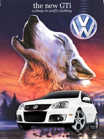
|
|
|
|
| dlo914 |
Oct 12 2006, 10:24 PM
Post
#10
|
|
Whatchu' lookin' at?!?! Group: Members Posts: 3,432 Joined: 6-September 04 From: San Gabriel, CA Member No.: 2,697 |
any suggestions that would go w/ the "sheep in wolf's clothing" theme? im pooped out of ideas (IMG:style_emoticons/default/yawn.gif)
|
|
|
|
| dlo914 |
Oct 12 2006, 10:51 PM
Post
#11
|
|
Whatchu' lookin' at?!?! Group: Members Posts: 3,432 Joined: 6-September 04 From: San Gabriel, CA Member No.: 2,697 |
i love VW ads:
(IMG:http://www.autointell.com/News-2004/August-2004/August-2004-1/VW-Ad-sm.JPG) (IMG:http://www.ciadvertising.org/student_account/spring_02/adv382j/ortega/howadv/vw.jpg) or this VW commercial not a real ad: Attached image(s) 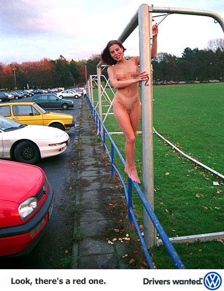
|
|
|
|
| dlo914 |
Oct 12 2006, 11:54 PM
Post
#12
|
|
Whatchu' lookin' at?!?! Group: Members Posts: 3,432 Joined: 6-September 04 From: San Gabriel, CA Member No.: 2,697 |
touch up of the first one:
Attached image(s) 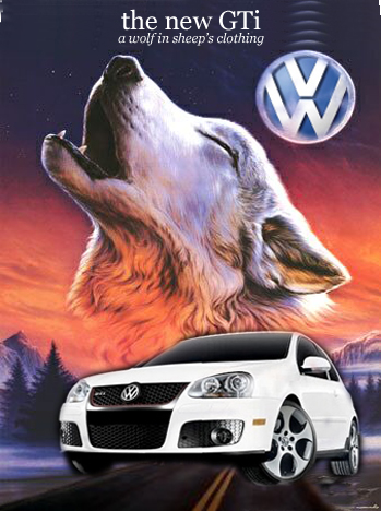 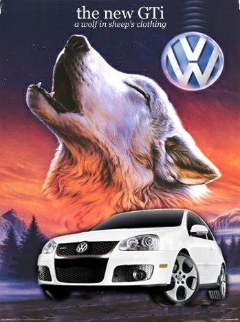
|
|
|
|
| cbenitah |
Oct 13 2006, 12:40 AM
Post
#13
|
|
Protected by the Swedish Maffia Group: Members Posts: 848 Joined: 16-August 05 From: San Diego, CA Member No.: 4,597 |
I like your idea, go further with it. Advertising is all about being out there but not to obvious. Right now your Layout is all over the place. Try to work off the grid. make a 3 colum grid and make it more balanced. its a little heavy to the right of the page. the VW logo doesnt have to be that big. a small suddle logo in the corner is fine. you are already showing of their car, no need to make it big. Were you making a bilboard or just a magazine ad? if its a billboard then its the wrong shape (IMG:style_emoticons/default/biggrin.gif)
Think less is more.. Thumbnails and Thumbnails.. That is the key. Easy to make changes and then lots to choose from. Good Luck |
|
|
|
| So.Cal.914 |
Oct 13 2006, 01:20 AM
Post
#14
|
|
"...And it has a front trunk too." Group: Members Posts: 6,588 Joined: 15-February 04 From: Low Desert, CA./ Hills of N.J. Member No.: 1,658 Region Association: None |
I believe that the VW emblem is the moon, nice touch but maybe a little more halo
so I am not the only one that knows. (IMG:style_emoticons/default/biggrin.gif) I think those VW's are more like a wolf in wolf's clothing compaired to my old 55 bug, and the pig's would be running in fear. Daniel Lo AKA D-Lo =) They call me P-low and not because I am vertically challenged |
|
|
|
| dlo914 |
Oct 13 2006, 01:41 AM
Post
#15
|
|
Whatchu' lookin' at?!?! Group: Members Posts: 3,432 Joined: 6-September 04 From: San Gabriel, CA Member No.: 2,697 |
QUOTE(cbenitah @ Oct 12 2006, 11:40 PM) I like your idea, go further with it. Advertising is all about being out there but not to obvious. Right now your Layout is all over the place. Try to work off the grid. make a 3 colum grid and make it more balanced. its a little heavy to the right of the page. the VW logo doesnt have to be that big. a small suddle logo in the corner is fine. you are already showing of their car, no need to make it big. Were you making a bilboard or just a magazine ad? if its a billboard then its the wrong shape (IMG:style_emoticons/default/biggrin.gif) Think less is more.. Thumbnails and Thumbnails.. That is the key. Easy to make changes and then lots to choose from. Good Luck Thanks! i do thumbnails while in class for just brainstorming. A grid, as in divide the canvas into 3 equal portions? I C how that would definitely help in my case. They're billboards, but billboards come in a variety of sizes other than the normal 12'x24'. Yup less is always more. The more you put into an ad the more distracting it becomes and the consumer doesnt read it right a way. Other than that i've gotta come up w/ a 3 ad campaign. All the ads have to relate or have one theme (i.e. the ipod ads where you see the ipod is highlighted and the person is just a black image w/ a single bright color background) |
|
|
|
| cbenitah |
Oct 13 2006, 01:49 AM
Post
#16
|
|
Protected by the Swedish Maffia Group: Members Posts: 848 Joined: 16-August 05 From: San Diego, CA Member No.: 4,597 |
I can see your train of thoughts there..
As for the moon, stay away from glows.. they are not looked at as a good design touch, just an advice.. Yes, divide the canvas into three portions and lay it out so you have the same amount of info in each part. remember white space is important for the eye and counts as a part of the whole, you dont have to put something into all the three parts (not all the way up if that makes sense) thumbnails can be more than brainstorming.. make quick sketches and see what you come up with, we have to do 50-100 different ones for class... As for ipod, they use color as their thread. colorful backgrounds and white ipod, not much text, which is important for a billboard, unless you are driving my car on the highway you won't have time to read the text.. If I were you I would make it suddle, a white background with just the car, maybe even just the wheel (or similar part) and something that indicates your "sheap idea" |
|
|
|
| So.Cal.914 |
Oct 13 2006, 02:07 AM
Post
#17
|
|
"...And it has a front trunk too." Group: Members Posts: 6,588 Joined: 15-February 04 From: Low Desert, CA./ Hills of N.J. Member No.: 1,658 Region Association: None |
Isn't calling it a sheep putting into the flock with all the other cars?
Thats one bad lookin little car and a wolf would pray on the sheep. Just a thought. (IMG:style_emoticons/default/burnout.gif) |
|
|
|
| dlo914 |
Oct 13 2006, 02:13 AM
Post
#18
|
|
Whatchu' lookin' at?!?! Group: Members Posts: 3,432 Joined: 6-September 04 From: San Gabriel, CA Member No.: 2,697 |
surprisingly i barely started using photoshop. In the past i would just use Microsoft Paint & Irfanview to alter and create images. The shirts ive done in the past were done w/ those two programs. But yeah my favorite tool on PS is the stamp tool. I actually prefer PS over Illustrator.
|
|
|
|
| cbenitah |
Oct 13 2006, 02:17 AM
Post
#19
|
|
Protected by the Swedish Maffia Group: Members Posts: 848 Joined: 16-August 05 From: San Diego, CA Member No.: 4,597 |
Here is what I was trying to say.. Made it little quick, but maybe you get my idea of being suddle.. you could do a much better job if you spend some time on it.. Just an idea...
Hope it helps, (Don't pay attention to the typography, just a place holder, didnt take the time to find your font) Attached thumbnail(s) 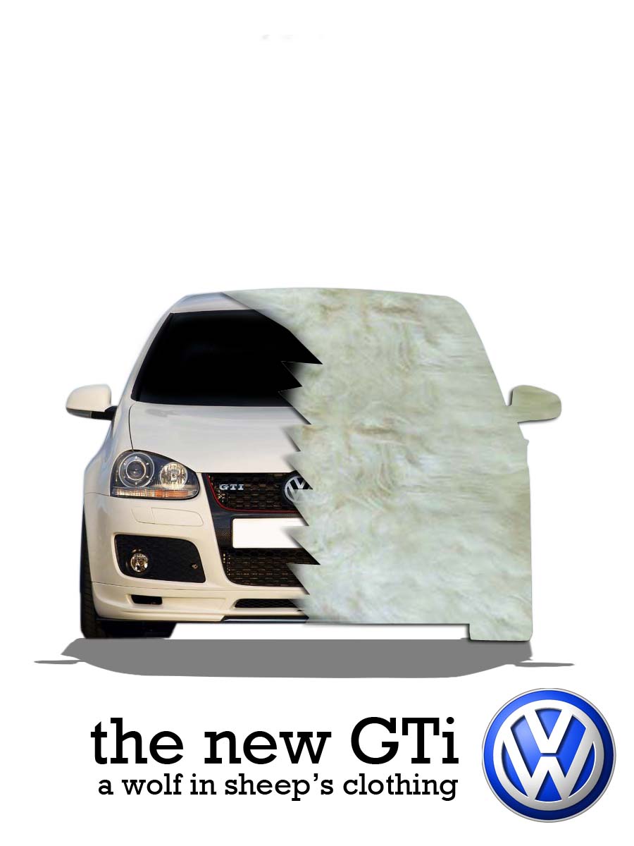
|
|
|
|
| dlo914 |
Oct 13 2006, 02:29 AM
Post
#20
|
|
Whatchu' lookin' at?!?! Group: Members Posts: 3,432 Joined: 6-September 04 From: San Gabriel, CA Member No.: 2,697 |
QUOTE(cbenitah @ Oct 13 2006, 01:17 AM) Here is what I was trying to say.. Made it little quick, but maybe you get my idea of being suddle.. you could do a much better job if you spend some time on it.. Just an idea... Hope it helps, (Don't pay attention to the typography, just a place holder, didnt take the time to find your font) that's more than clear (IMG:style_emoticons/default/clap56.gif) much thanks! i had a friend tell me to do the same thing but i didnt know how to put it. |
|
|
|
|
1 User(s) are reading this topic (1 Guests and 0 Anonymous Users)
0 Members:

|
Lo-Fi Version | Time is now: 9th May 2024 - 03:25 AM |
Invision Power Board
v9.1.4 © 2024 IPS, Inc.