I've searched the site and can't find the right font for the numbers that are used on Porsche's dash gauges like this.
Click to view attachment
Anyone know where to find it?? I have a custom face I need to design. Thanks!
Full Version: Font for gauge numbers?
Try this site abstract fonts
scroll down to the "914 solid" font. Fun, regardless.
scroll down to the "914 solid" font. Fun, regardless.
DIN 1451 fette Breitschrift 1936 is likely the closest digital version, not sure if the numbers are extended enough.
"Din", which is an acronym for the German "Deutsches Institut für Normung" (German Institute for Standardization) approved the typeface for use in road signs etc in Germany.
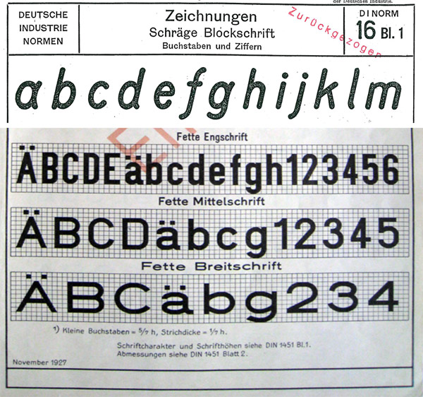
http://www.ffonts.net/DIN-1451-fette-Breitschrift-1936.font
http://www.fontspace.com/peter-wiegel/din-...eitschrift-1936
The 4 is closed there, but open in the font/ digital version. The font, though, the 7has a hook and it's a little crude being a free font. It's very similar to the transportation signage-inspired (and better looking digital version) "Interstate" but the 4 in that is closed. I think Adobe makes better looking versions of din, Mittleshrift and din Eingshrift but those are regular and condensed. Anyway, very close to din.
http://de.wikipedia.org/wiki/DIN_1451
"Din", which is an acronym for the German "Deutsches Institut für Normung" (German Institute for Standardization) approved the typeface for use in road signs etc in Germany.
http://www.ffonts.net/DIN-1451-fette-Breitschrift-1936.font
http://www.fontspace.com/peter-wiegel/din-...eitschrift-1936
The 4 is closed there, but open in the font/ digital version. The font, though, the 7has a hook and it's a little crude being a free font. It's very similar to the transportation signage-inspired (and better looking digital version) "Interstate" but the 4 in that is closed. I think Adobe makes better looking versions of din, Mittleshrift and din Eingshrift but those are regular and condensed. Anyway, very close to din.
http://de.wikipedia.org/wiki/DIN_1451
Thanks guys. I definitely have some playing to do now. . .
QUOTE(aircooledtechguy @ Feb 23 2012, 08:51 PM) 
I've searched the site and can't find the right font for the numbers that are used on Porsche's dash gauges like this.
Anyone know where to find it?? I have a custom face I need to design. Thanks!
Anyone know where to find it?? I have a custom face I need to design. Thanks!
This is what i used, i can find the font when i get home tonight:
http://www.914world.com/bbs2/index.php?showtopic=94790

This is a "lo-fi" version of our main content. To view the full version with more information, formatting and images, please click here.