outlaw
Click to view attachment
Full Version: 914World badge design contest ...
QUOTE(7TPorsh @ Nov 19 2014, 10:12 AM) 
How about a while color car in red background?
Thank you
QUOTE(7TPorsh @ Nov 19 2014, 01:11 PM)
How would this one look with the outer ring in black? This design is a good direction, imho.
![popcorn[1].gif](http://www.914world.com/bbs2/style_emoticons/default/popcorn[1].gif)
QUOTE(7TPorsh @ Nov 19 2014, 01:59 PM)
 This looks great!
For some reason, I think a blue car would look even better.
I like all of these...I do have a comment about the car in the center...from a perspective point of view. The passenger window looks a little of whack...the top edge of the glass and the sill edge should be parallel, or closer to parallel...does any else see this?
QUOTE(DblDog @ Nov 19 2014, 11:09 AM)
I like all of these...I do have a comment about the car in the center...from a perspective point of view. The passenger window looks a little of whack...the top edge of the glass and the sill edge should be parallel, or closer to parallel...does any else see this?
A little off. I don't think you will see it on a 3" badge. That section will be 1/4".
Car color wise I think we should stick to the popular colors or the flag colors.
red, yellow, black, silver. Yellow may add horsepower to the badge....

I'm just wondering if Sir Andy thought this would go smoother. I personally thought there would be more entries and one entry would just stand out with sunbeams shining down on it. So many talented people on this site that make parts and others that save rust buckets. Graphic design team we seem to be missing. I like all the entries and thank everyone that submitted. Andy will have a tough decision.
thanks for all of this - one question/comment - i thought that 1969 was the first year of production for the 914?
brad in seattle
brad in seattle
QUOTE(pisces914 @ Nov 19 2014, 11:28 AM)
thanks for all of this - one question/comment - i thought that 1969 was the first year of production for the 914?
brad in seattle
Some of the 70 cars were built in 69 but I think the first "model" year was 1970.
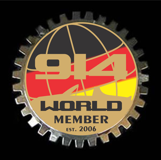
I really like the idea of the German flag Black/Red/Gold in the center and using the 914 outline as well.
So, here are 4 more suggestions, with both gold and white accents ...
Click to view attachment Click to view attachment
Click to view attachment Click to view attachment

So, here are 4 more suggestions, with both gold and white accents ...
Click to view attachment Click to view attachment
Click to view attachment Click to view attachment
QUOTE(SirAndy @ Nov 19 2014, 11:55 AM)
I really like the idea of the German flag Black/Red/Gold in the center and using the 914 outline as well.
So, here are 4 more suggestions, with both gold and white accents ...
Click to view attachment Click to view attachment
I like the second and fourth. Love the dates on the side, the silhouette of the car, and does not look like the club badge examples people have posted.
Dates are tricky; looks like we are dating the world. Two more gold and chrome. Remember these are badges so lettering and borders/outlines are polished/plated metal. Unless we are just printing the whole thing on a badge.
If the real thing like Mikey914 shows, then designs need to accommodate. So if its gold; the metal is gold and the badge is gold. Chrome lettering, chrome badge. Andy's gold lettering on a chrome badge will need to be painted.
These can be with or without gear outline shape.
gold
Click to view attachment
chrome
Click to view attachment
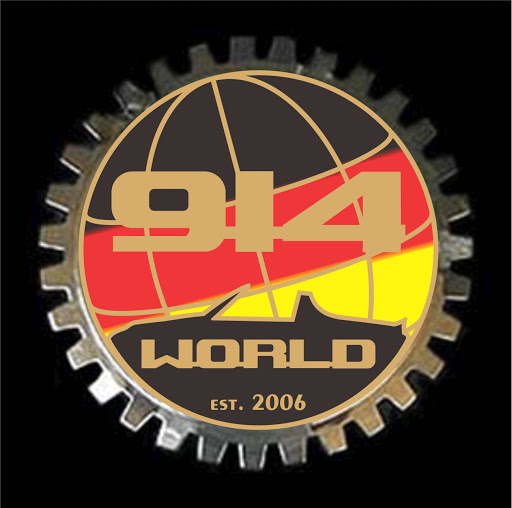
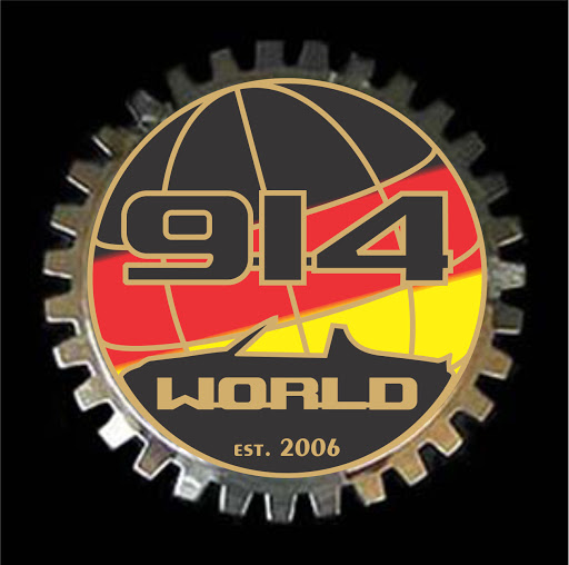
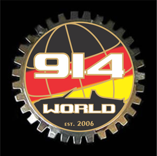
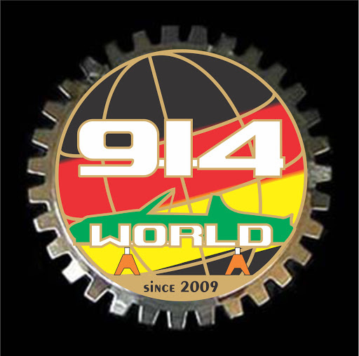
If you're going to use the German flag colors, please make sure you put them in the correct order.

QUOTE(SirAndy @ Nov 19 2014, 01:27 PM)
If you're going to use the German flag colors, please make sure you put them in the correct order.
ha, sorry, not German....Czech actually.
howzdeeese
Click to view attachment
I like this
If it has the years designation, I think it should have all years not just beginning and ending years. Perhaps something like this 
Click to view attachment

Click to view attachment
I still say replace MEMBER with (OUTLAW)
just my 0.2
can't Photoshop to see what it looks like.
just my 0.2
can't Photoshop to see what it looks like.
QUOTE(7TPorsh @ Nov 19 2014, 02:41 PM)
QUOTE(SirAndy @ Nov 19 2014, 01:27 PM)
If you're going to use the German flag colors, please make sure you put them in the correct order.
ha, sorry, not German....Czech actually.
howzdeeese
Click to view attachment
I like this one without the 914 in the middle and add the gear teeth.
Dave
LAST DAY !
Any chance they can be offered in both "gear" edge and smooth? I know a lot of people like the gear edge but it's just not my "stein of Heineken".
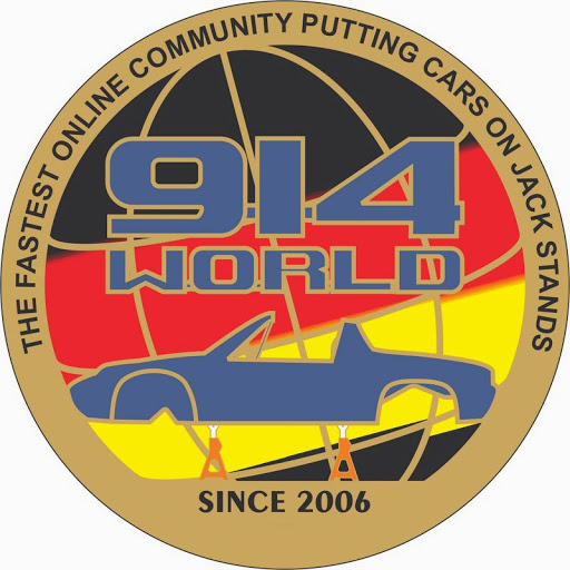
I’m leaning towards SirAndy’s proposal (post #166). I’m curious as to how it would look with a few modifications to his lower left image.
Specifically, change the center globe top half with a hammer-textured recessed “Earth” and smooth raised “Lat/Long” lines (both same finish as outer ring gear). I’d change the flag color order (obviously), but instead of printing out “914” in the center, I'd recommend a chrome vehicle silhouette (or raised silhouette outline) on the black flag portion. On the red portion, I'd recommend “1970-1976” in black.
The large “914” is not necessary (redundant) with the top outer circle reading “914WORLD.COM”. Either “Member” or “Vereinsmitglied” on the bottom (non-committal).
Also, by leaving out the “obvious to us” “914”, we can answer stupid questions with “It’s Ferrari – don’t touch”...Italian accent optional.
Thoughts?
All final designs need to be submitted today to vote on the one we want.
I like the whole car outline a lot more than just the top window
years make it confusing....are those the years you are a "member"?
Lookin good

^^^ I agree. As I mentioned in an earlier post, the version with just the top center of the car looks like the back end of a tow truck at first glance.
When will the poll start?
QUOTE(poorsche914 @ Nov 19 2014, 05:50 PM)
If it has the years designation, I think it should have all years not just beginning and ending years. Perhaps something like this
Click to view attachment
I concur that having all of the years is very attractive. I think it makes it more clear what the dates are for as well. Just my .02
Tried to come up with something different. Sucks working from the laptop... so the car will need to be tweaked from my 914turbo logo and the stripes are supposed to fit in the globe grid but here's the idea.
One more, matching car color option.
More brass/silver
ok, last one... for fun.
One more, matching car color option.
More brass/silver
ok, last one... for fun.
I really like the simplicity and coloring of this second one.
John
John
Hours left
Wow, I see two things going on here....design AND coloring. As well as gear or no gear...so three....this will be interesting. Also variations on a design....(popcorn)
QUOTE(arkitect @ Nov 20 2014, 05:26 AM)
QUOTE(7TPorsh @ Nov 19 2014, 02:41 PM)
QUOTE(SirAndy @ Nov 19 2014, 01:27 PM)
If you're going to use the German flag colors, please make sure you put them in the correct order.
ha, sorry, not German....Czech actually.
howzdeeese
Click to view attachment
I like this one without the 914 in the middle and add the gear teeth.
Dave
Last entry for me.....what now?
Click to view attachment
2nd one is smoking hot & the first is funny as hell 
Just an update to the 'fun' one with the proper car.
This is a "lo-fi" version of our main content. To view the full version with more information, formatting and images, please click here.